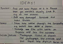
Ideas and exploration - Inside Outside
|
For Component 2 I have decided to chose Inside, Outside. This is because to me, the connection and difference between the two spaces is interesting and can be interpreted in may ways, especially through photos.
|
|
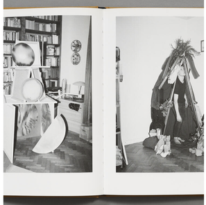
Joanna Piotrowska - Frantic
|
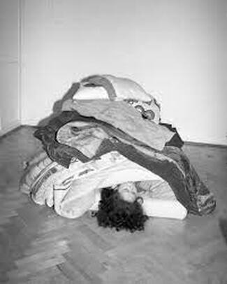
Her book Frantic presents a series which is entitled “Shelters”, it consists of black-and-white photos which were taken in 2016-2017 in Warsaw, Lisbon and Rio de Janeiro. The photos present temporary constructions which are built inside domestic households, on balconies and in gardens. They are based on the common children's game in which the children build a shelter, tent, house, bunker or fort within their own domestic space. And the process of making a situation in which adults build protective, temporary shelters is as important for Piotrowska as the final outcome in her photos. these forts are show both empty with no-one inside and without them protecting anything and as ‘shelters’ occupied by and protecting a member of the household from the rest of the house. As if the domestic house hold itself didn't provide enough protection from the outside world. The project was also inspired by homeless people's temporary constructions and by the general notion of home. Her project links to the inside outside theme in a way in which could be controversial to the very obvious meaning of the topic. however in a deeper meaning, the projects built houses in these domestic areas make the domestic places the outside to these structures. This is an interesting approach to the theme because for us, houses are considered to be safe, warm and full of love. Yet in Piotrowskas photos the houses are made to seem like the complete opposite, as if the house was dangerous and that's why these people are building these structures inside them to further protect themselves. Children build forts to escape from the very scary reality they live in. Whether it's the rapidly changing climate of our world, or simply the stresses felt by families within the home, a fort provides a sense of shelter, allowing children to benefit from the illusion that they have an invincible little spot in the house that belongs only to them. Building a fort is a way for children to ensure they have a safe place to retreat to when they need one. |
Image Evaluation Joanna Piotrowska - Frantic
There's a lot that is happening in the frame of this photo, the main focus point in the photo being the hide away that is built up from many different items, it reminds the viewers of the forts that children build when they play, it can bring back nostalgia for many people. On both the sides of the images, there are two people sitting down, both with their legs crossed in similar ways, as if they are looking after the person in the tent. the woman in the tent seems to be reaching out, however it also looks as if she is getting pulled out the tent. It seems as though the woman is trying to hide away from everything going on around her, yet somethings dragging her out of her hiding spot. The black and white coloured photos, makes the photo feel like it has a more intense message for the viewers, and that links to their own personal lives and their home.
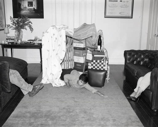
Response to Joanna Piotrowska - Frantic
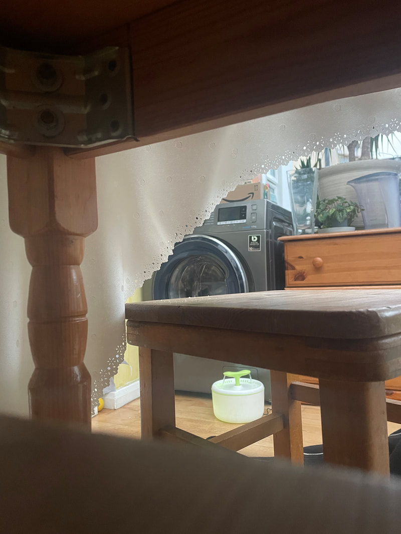
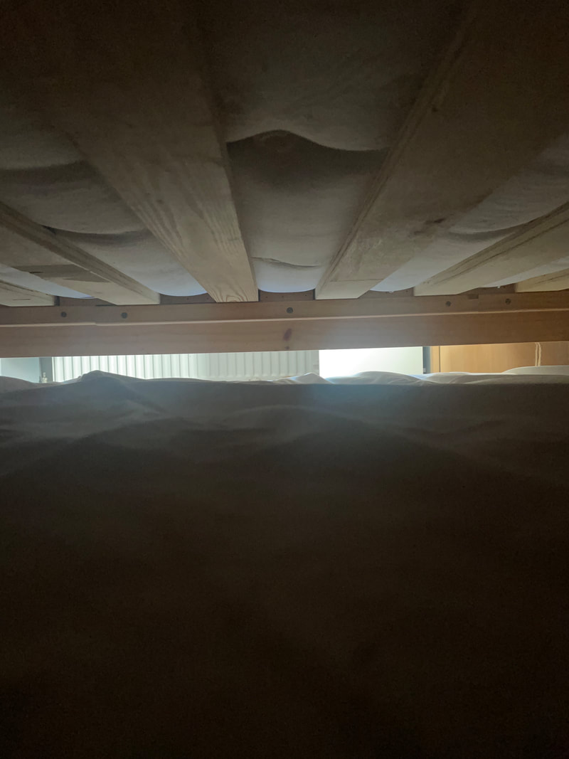
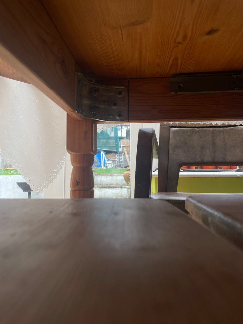
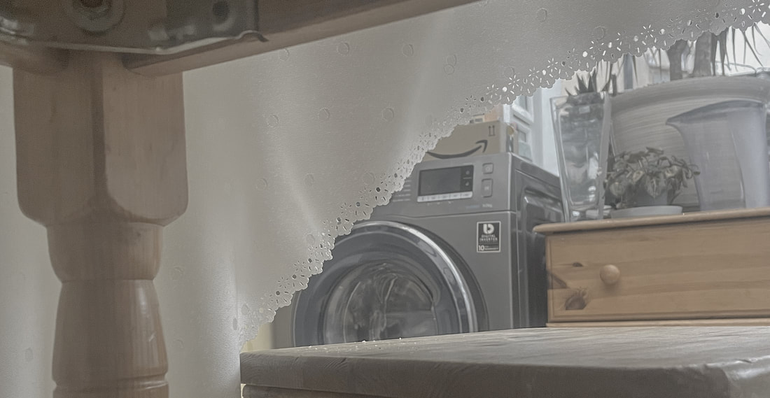
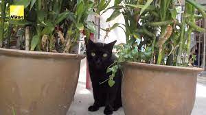
For my response to Joanna Piotrowska - Frantic I decided to take a twist and add the theme inside outside to my response. I took photos from my cats perspective, doing my best to take photos from the inside of her favourite hiding spots to still reference Piotrowskas work in my own. Cats find and use their hiding spots to find safe spaces to sleep, lie in and wait to pounce on a toy, or just simply because they feel safer hidden away from all the chaose that's going on around them. I like these photos however I would want to make them seem more obvious that they are taken from a cats perspective.
... Editing the photos ...
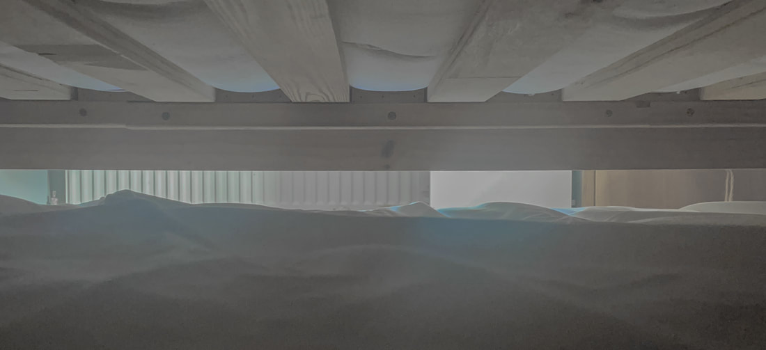
To edit these photos I did some research to find out how cats see the world and through that I found out the they are great at seeing the world in many diffrent shades of grey, and they see blues and yellows well. However, cats have trouble distinguishing greens and reds. Red, in particular, is just seen as "dark" to cats. Based on this research and some of the interpretational photos on what cats see that I saw, I edited my photos.
- Edit explained -
|
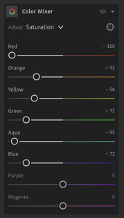
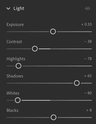
During the editing process, I first used the colour mixer tool and I took out all the reds as well as most of the oranges and greens, the orange I turned down because it is next to red on the colour wheel, meaning that most likely cats can't see orange that well either, then leaving most of the blues and the yellows in the photo alone but turning then down a little bit, to further add to the effect. Because there were no purples or magentas in the photo I left the two alone. Doing this allowed me to get a similar effect on the photo as to the one I saw online that referred to what cats see. For the lighting, I edited the photo so that the objects where a bit fait on their line this is because cats can't recognise sharp lines between objects as well as humans can. I also made the picture have a small white haze overtop, this was because cats can't see very well up close and I wanted it to be a representation of that. Finally I cropped the image, I cropped the picture and made this image landscape instead of portrait, I believe that this better represents the way that cats see the world. This is because Cats have a wider field of view which is about 200 degrees, compared with humans' 180-degree view. I completed all of these steps for all the photos in my response to Joanna Piotrowska - Frantic
|
William Eggleston
|
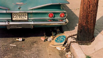
Eggleston began his career shooting in black and white, he started at a time when black and white photography had started to to be accepted as an art form. in his early days, he called attention to familiar places / spaces in peoples lives and objects that are in it. He created pictures of an everyday scene as he shot from an unusual angle, and the subject matter and cropped composition mix together producing a snapshot.
He makes his pictures visually interesting by playing with scale, shooting many different photos from many different angles, a good example of this is when by shooting from a low angle, the tricycle in the photo which is a small child's toy, is made to look huge, dwarfing the two ranch houses in the background. The composition on this image is very natural and it doesn't seem forced upon the viewers at all, the tricycle may even bring back a sense of nostalgia for the viewers. |
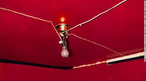
One of Eggleston's most famous pictures, Untitled (Greenwood, Mississippi)also known as The Red Ceiling, depicts a closeup view of the intense, red ceiling and far corner of a friend's guest room. Slightly left of centre is a light fixture with a bare bulb and three white cables stapled to the ceiling leading out towards the walls. He always has
good colour combinations in his pictures. His photo, enhanced by his dye-transfer process, ultimately enabled colour photography to become an actual art form. For this picture he once said, the deep red colour was "so powerful, I've never seen it reproduced on the page to my satisfaction. When you look at a dye-transfer print it's like it's red blood that is wet on the wall."
good colour combinations in his pictures. His photo, enhanced by his dye-transfer process, ultimately enabled colour photography to become an actual art form. For this picture he once said, the deep red colour was "so powerful, I've never seen it reproduced on the page to my satisfaction. When you look at a dye-transfer print it's like it's red blood that is wet on the wall."
Response to William Eggleston
For this response I wanted to experiment a bit with the levels and heights that William photographs, specifically the photo above.
in this set of photos, I decided that I wanted to play around with different levels when photographing things. I decided that a good idea would be to walk around my house and take photos from high ups, I came up with the idea of making the photos shot in a flys point of view as I believed this to be an interesting aspects, after I took the photos, like the cat photos that I had edited, I also edited the photos after doing some research too see what flys really see and I did my best editing those together, this was a similar process as to the cats one, however I had to change the clarity and the focus of the picture to achieve the effect.
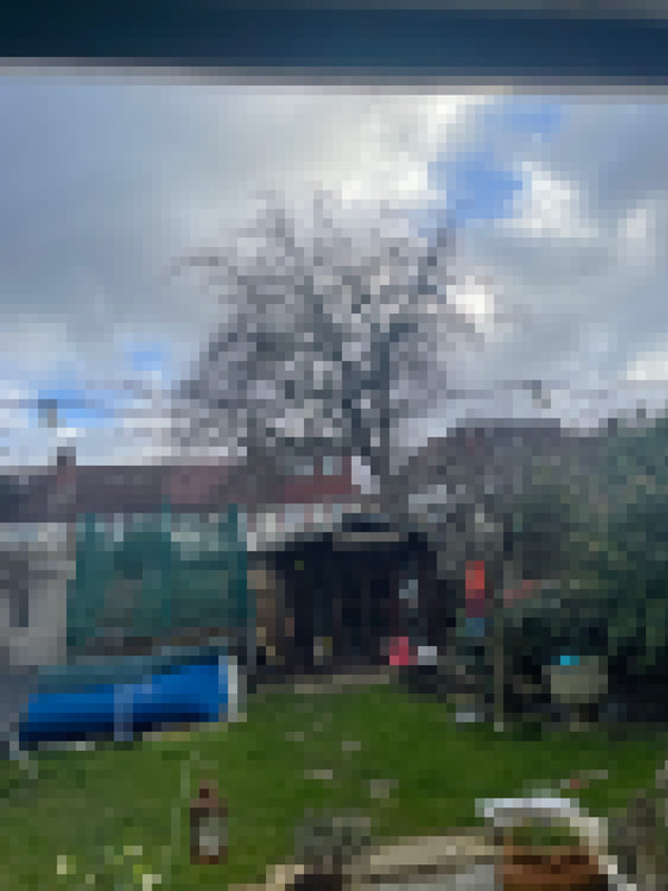
Small inside outside Photoshoot
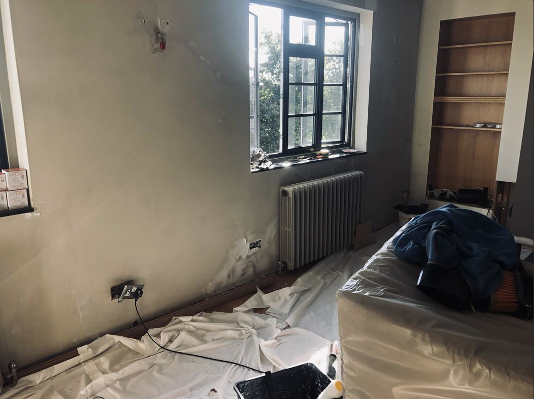
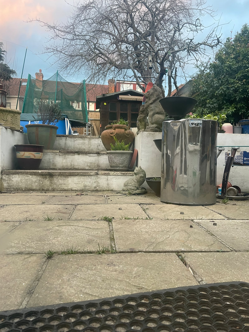
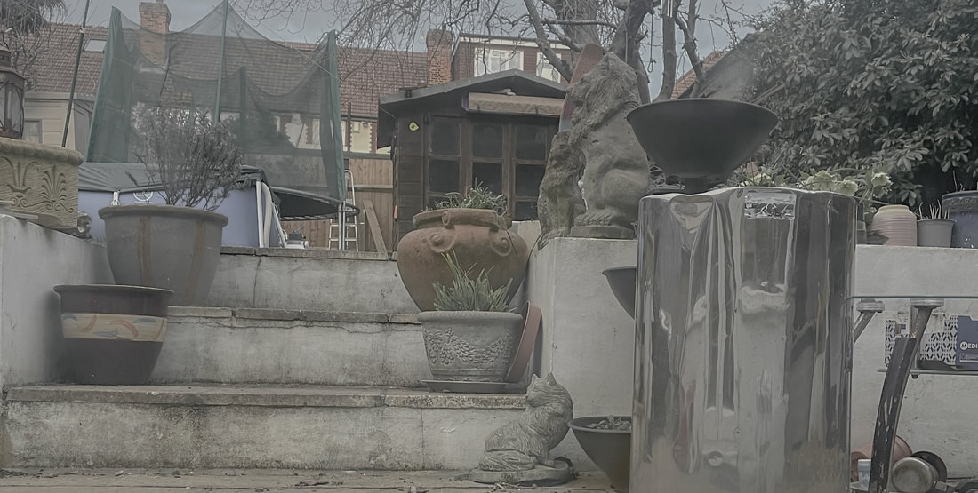
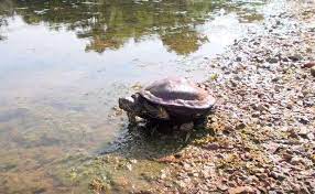
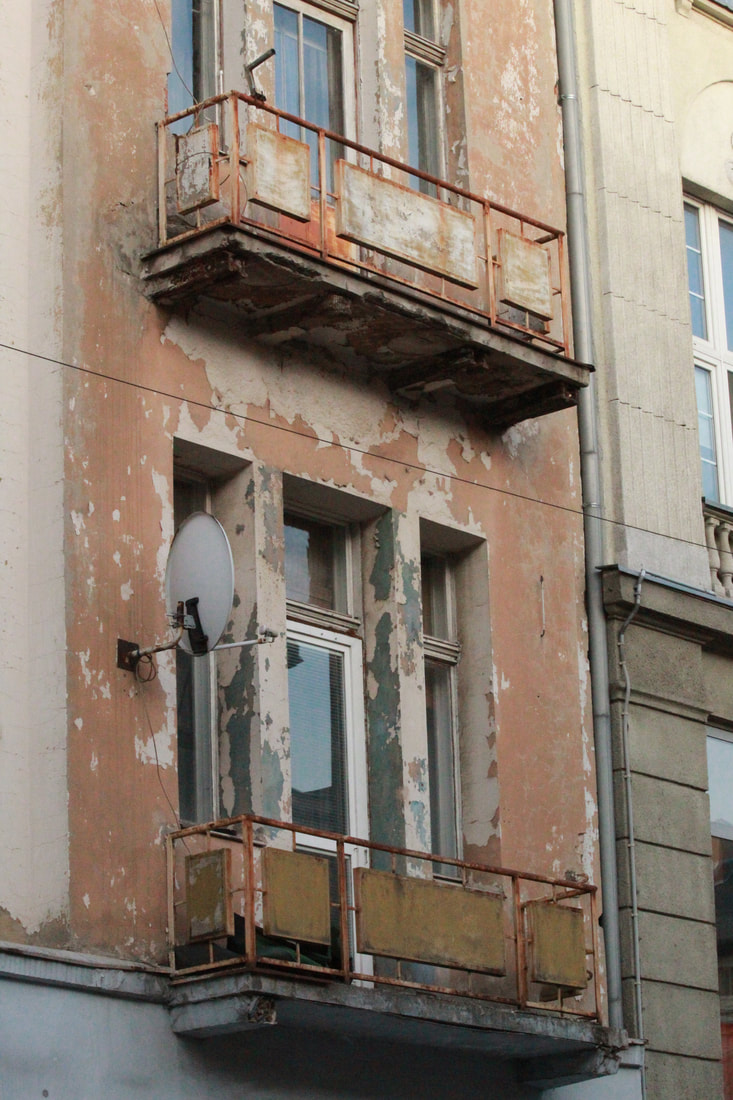
I Started taking my own photos away from artist responses because I wanted to get into the habit of taking photos in the theme inside outside, without being influenced by other peoples work. To do this, I went out to work with my dad and as we worked throughout the day, I took a couple photos that I considered to fit the theme, I believe that this gave me a good idea of what I want to experiment within my photos further. Overall I enjoyed the shoot and I enjoyed having the freedom to take my own photos without other artists influences.
-Favourite photo and explanation-
|
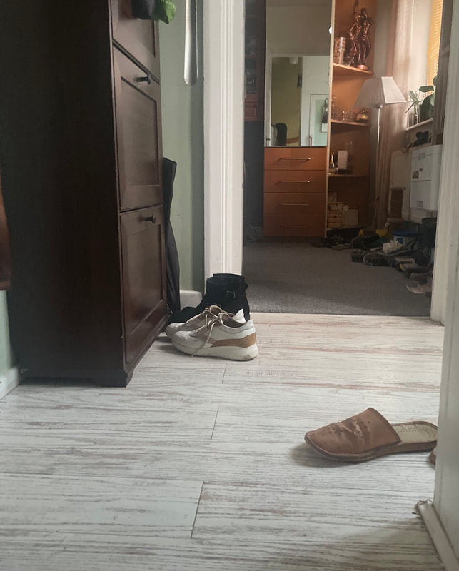
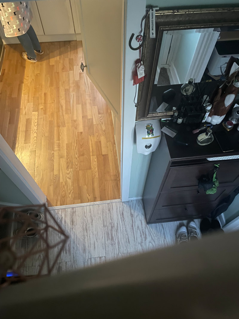
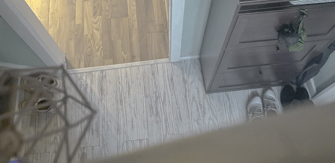
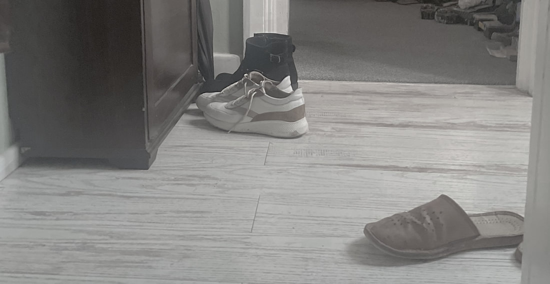
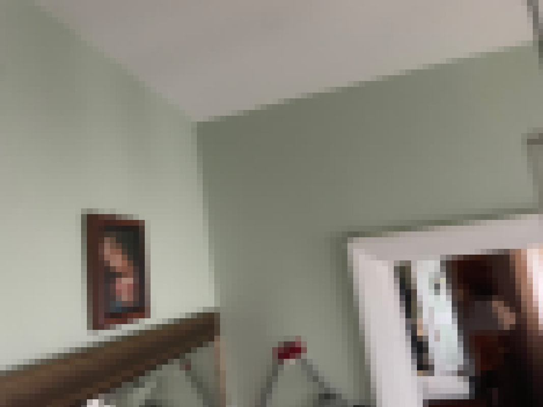
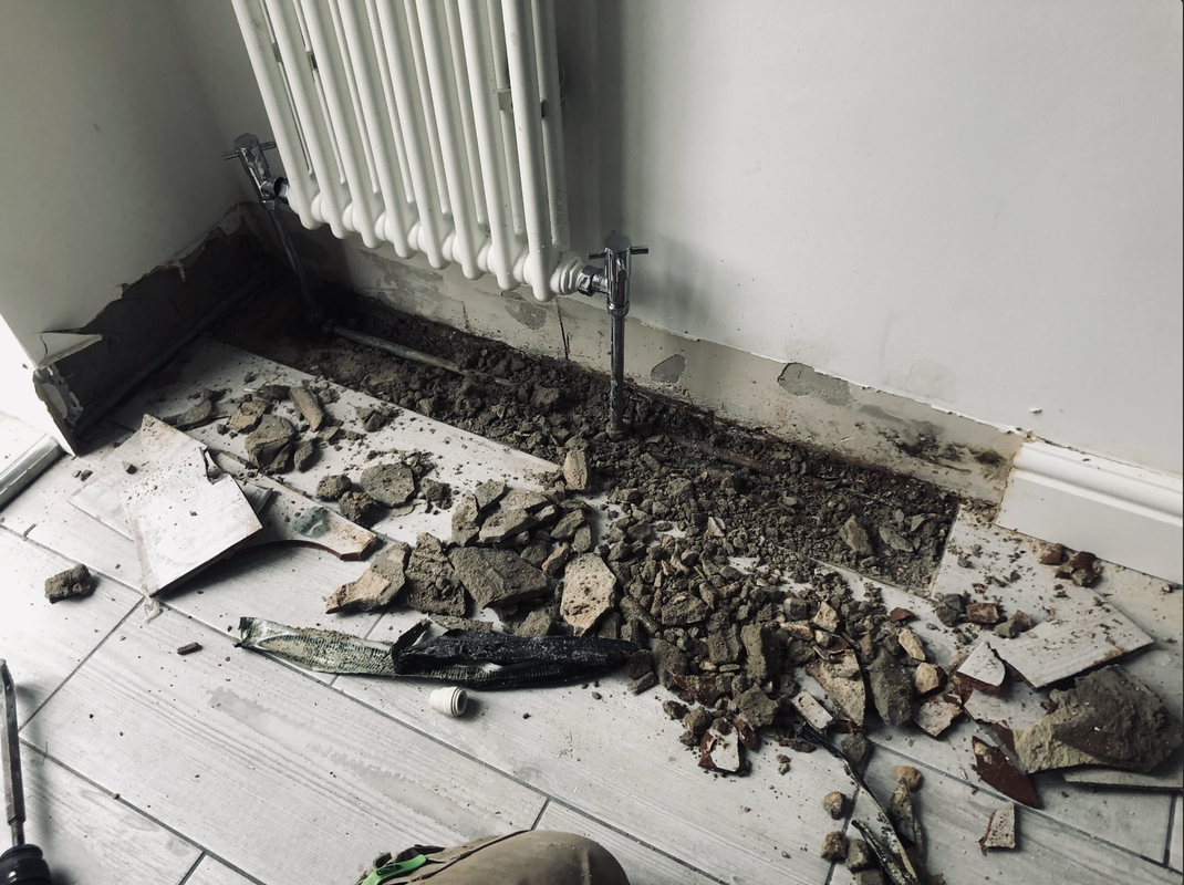
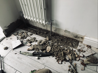
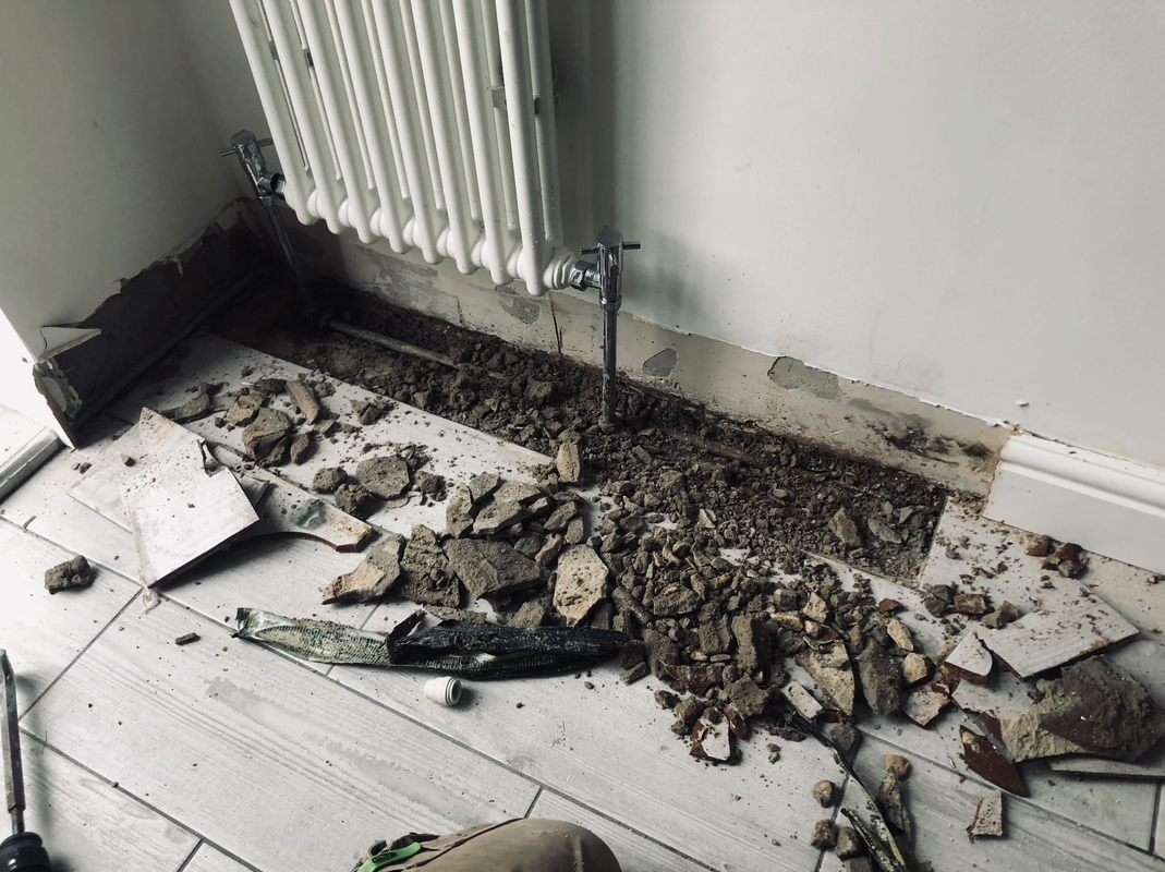
This photo is my favourite one from the photos that I took when working with my dad. I like this photo because it contains things that belong where they are. For example, the dirt here doesn't belong inside the house and it makes a nice contrast to the nice flooring and painted walls around it. After this photoshoot, I realised that I want to focus more, and photograph more things that are inside but belong outside and things that are outside but belong outside as I believe that this is an interesting topic to me.
|
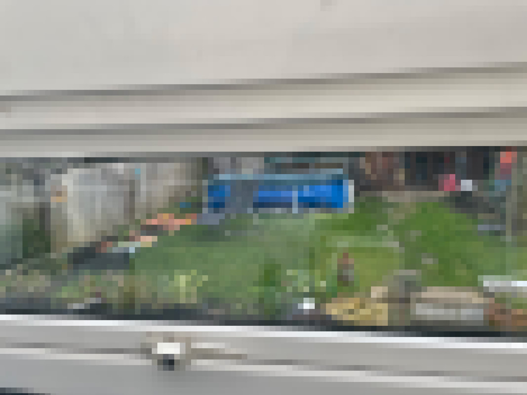
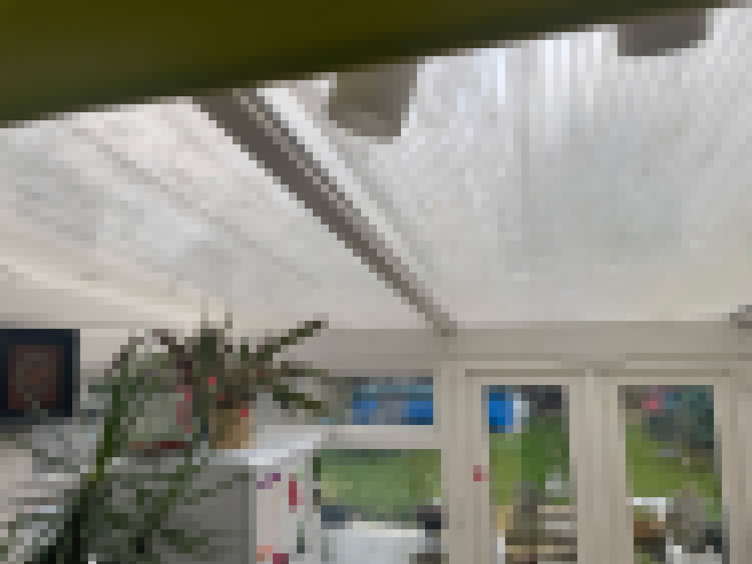
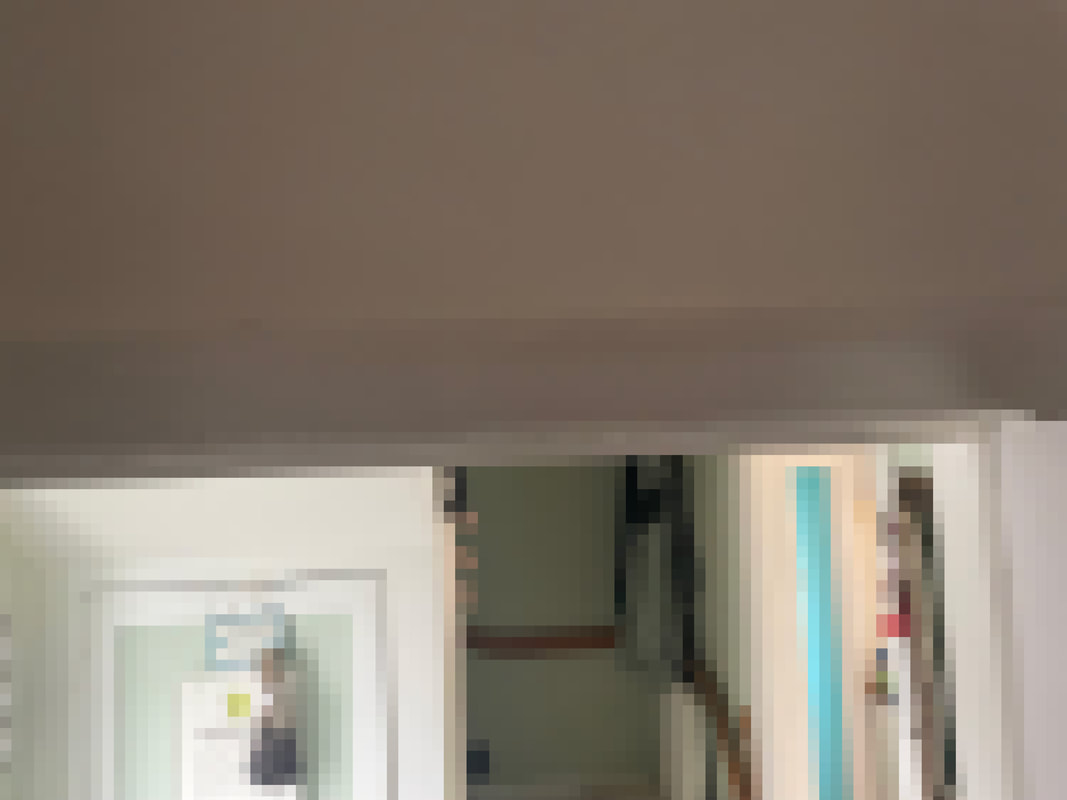
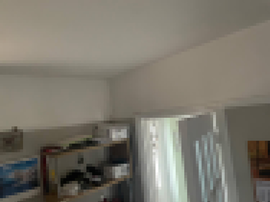
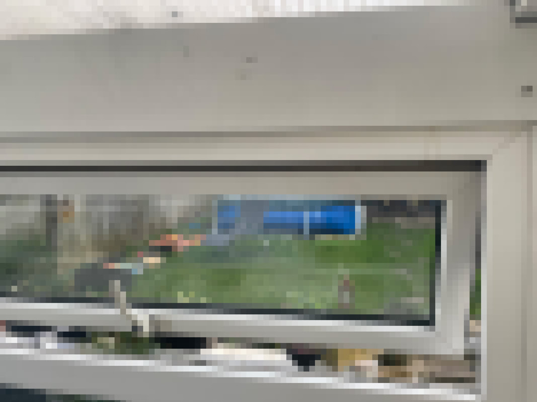
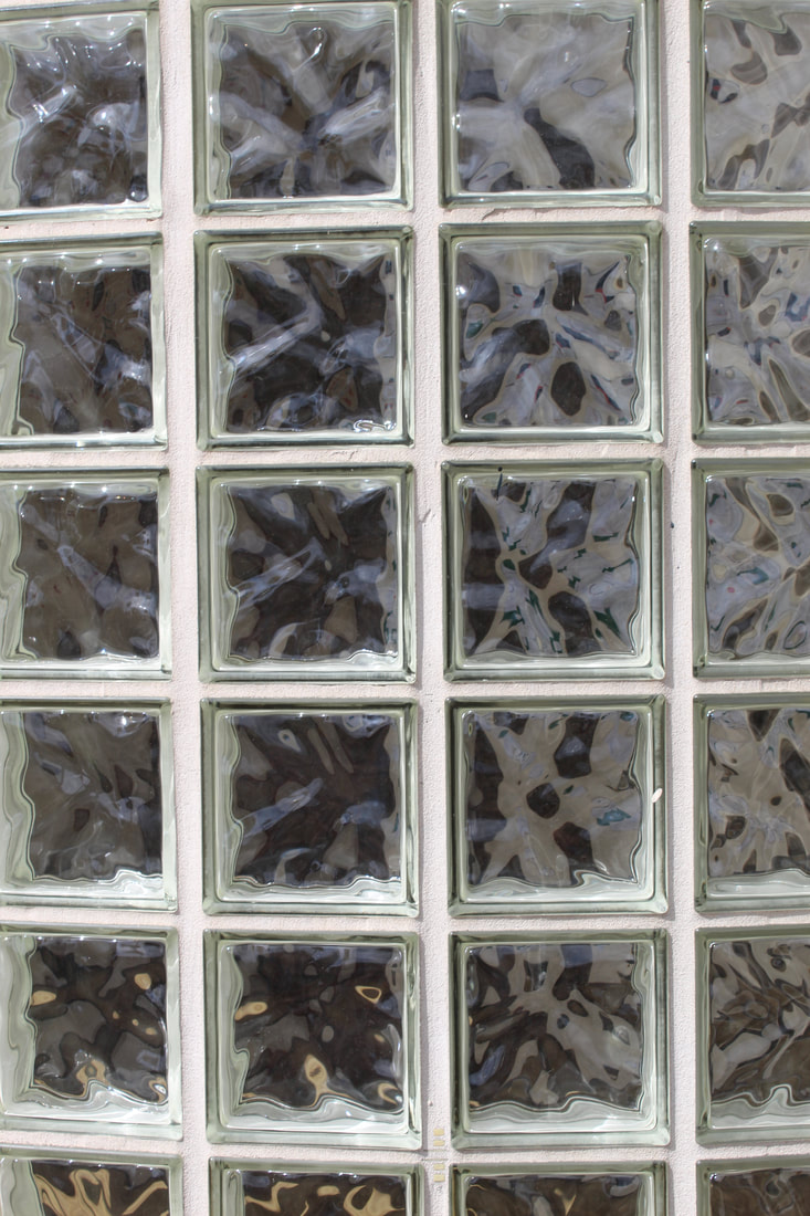
In School Photos
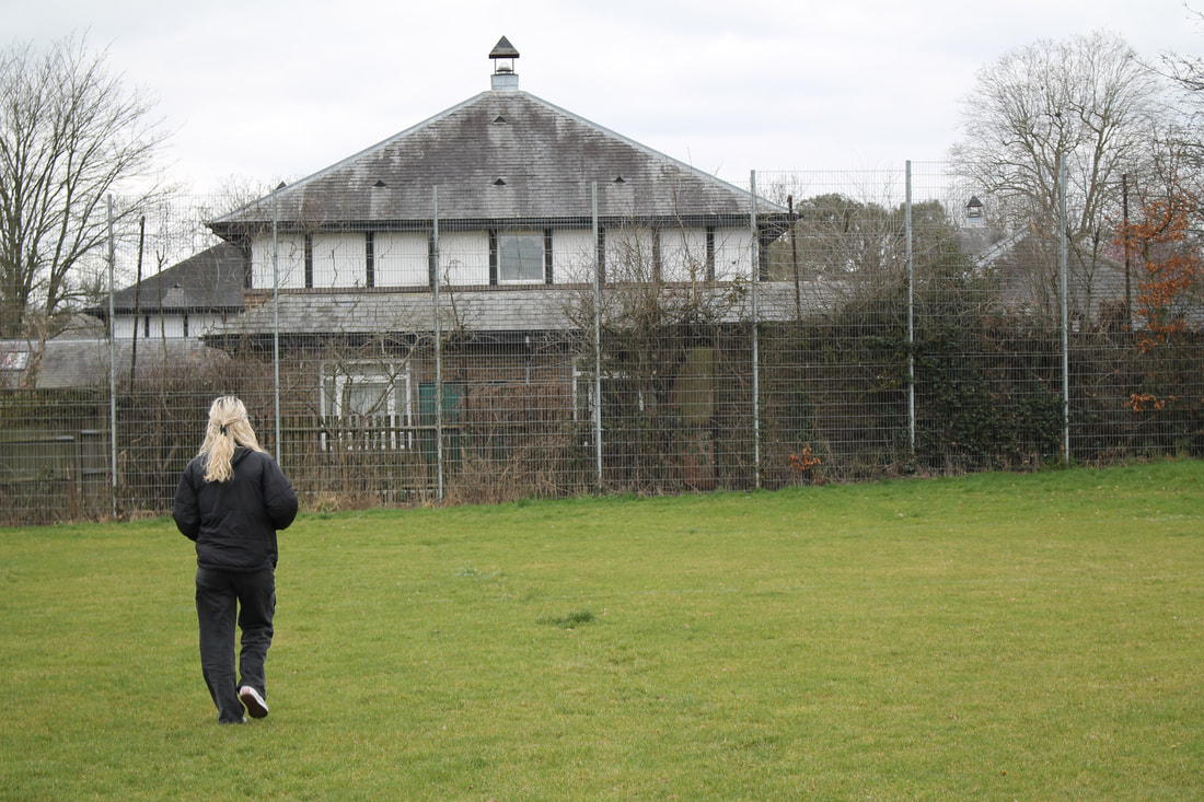
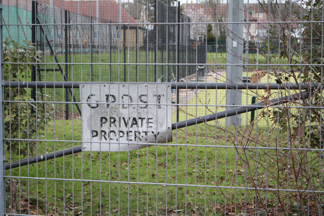
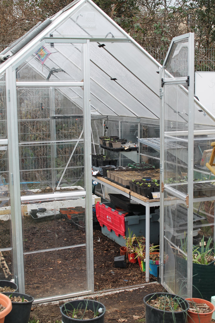
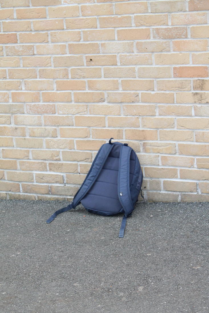
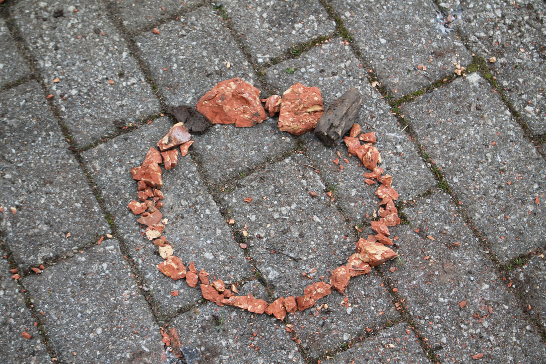
When going around the school and taking photos, I wanted to still try to focus on my chosen theme, inside outside. My explanation for the photos is quite simple, things like the bag being left outside, which is normally spotted inside, or all the photos through the fence where the photo was taken from the inside of the fence out. The greenhouse although you can see in from the outside because of the glass, once you step inside, it is still considered an inside space. Finally the rocks in a circle, I photographed these because both the outside and the inside of the circle can be seen in one simple photo. I think that overall the small photoshoot went good, however I think that taking photos in school is quite strangling and it holds back our creativity because we are limited to the facilities in the school.
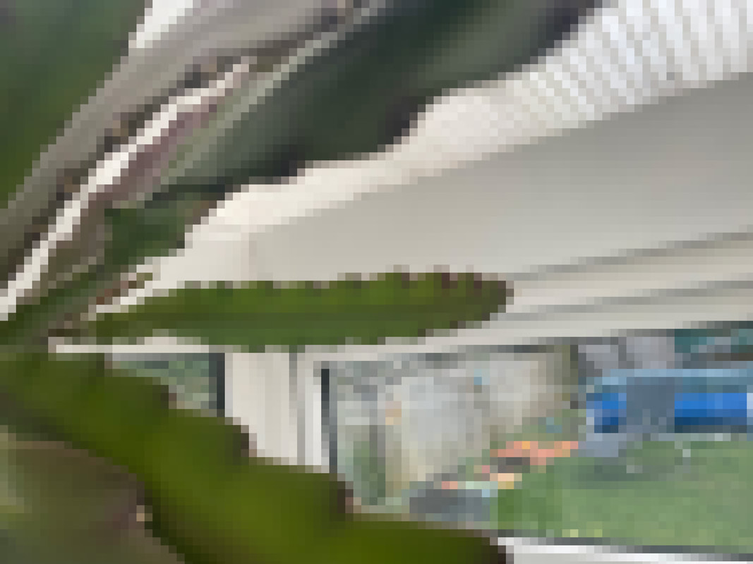
-Favourite Photo and explanation-

|
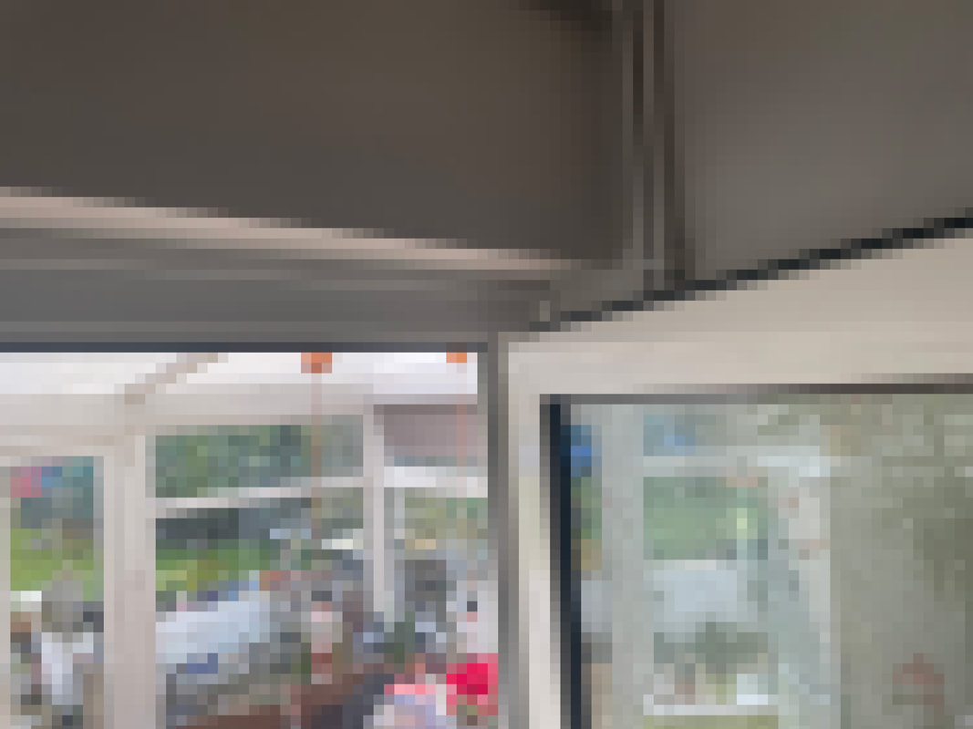
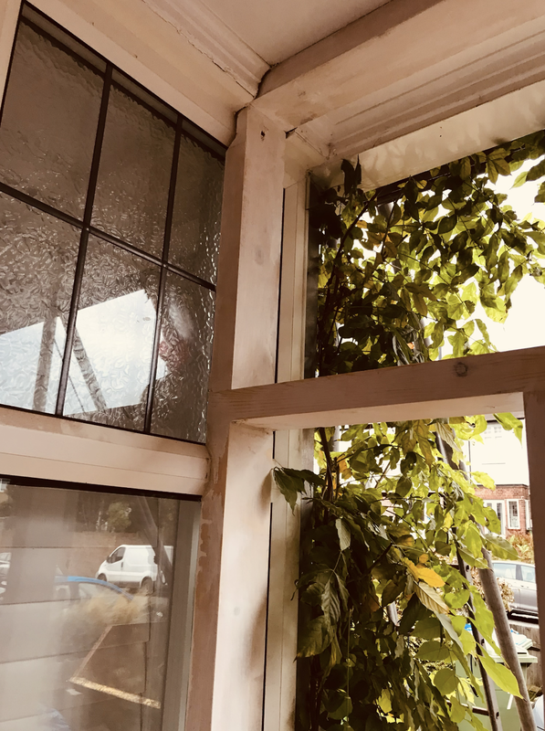
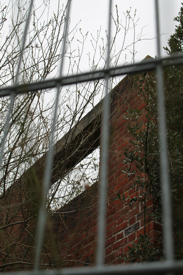
This is my favourite photo because it not only clearly sticks to the theme of inside outside, but it also has a gloomy and intense feeling to it. The fact the that photo is taken behind a fence, may make the viewers feel trapped as there is alot going in both the fore ground and the background of the photo
|
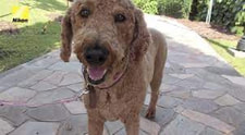
Grizzler the Phodographer
Grizzler is a dog whom which carries a camera on his chest and a heart rate monitor on his neck. when his heart rate raises, the camera snaps a photo and the two are connected via Bluetooth. With the “Heartography” heart monitor and photo camera system, the aim is to let dogs show their owners what excites and interests them by snapping a photo from their point of view every time their heart rate goes up. The camera and 3D-printed case together are bulky, and many people think that its a publicity stunt from Nikon to advertise but It does give the viewers a set of amusing images showing off all the things that get a dog excited, like people, upset cats and other dogs.


One on the other experiment
For this experiment, I decided to pick two different photos which were both on the same orientation yet one was outside and the other inside and I decided to print one on top of the other to see what the result would appear like.
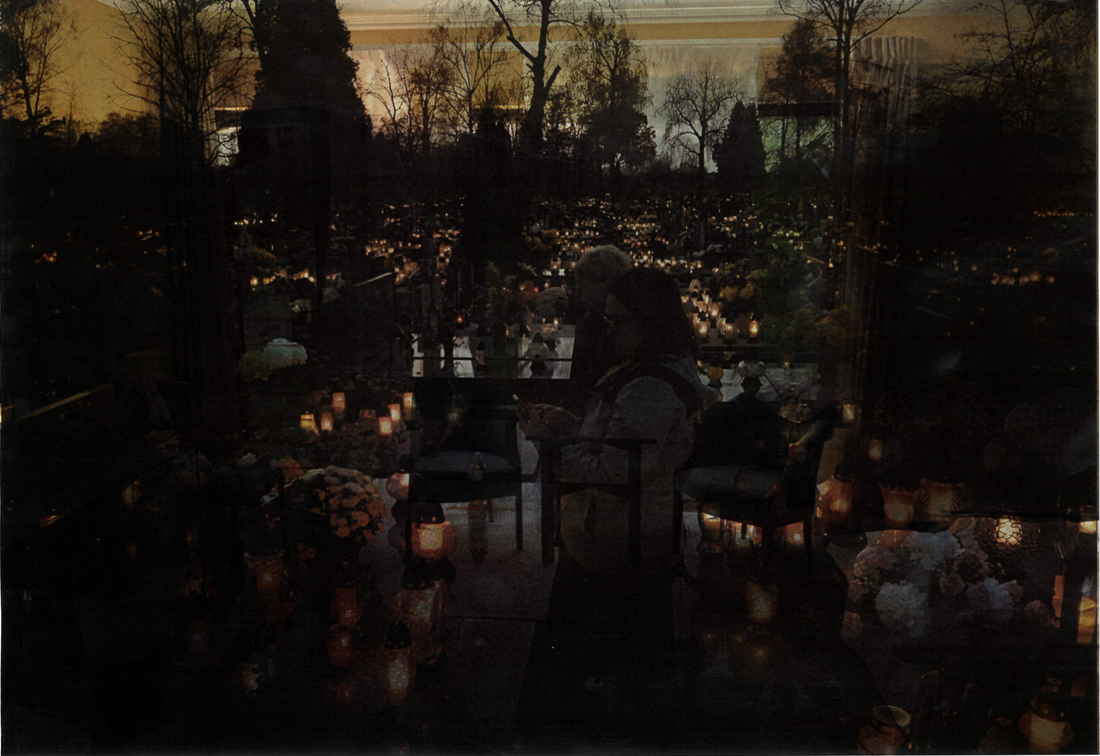
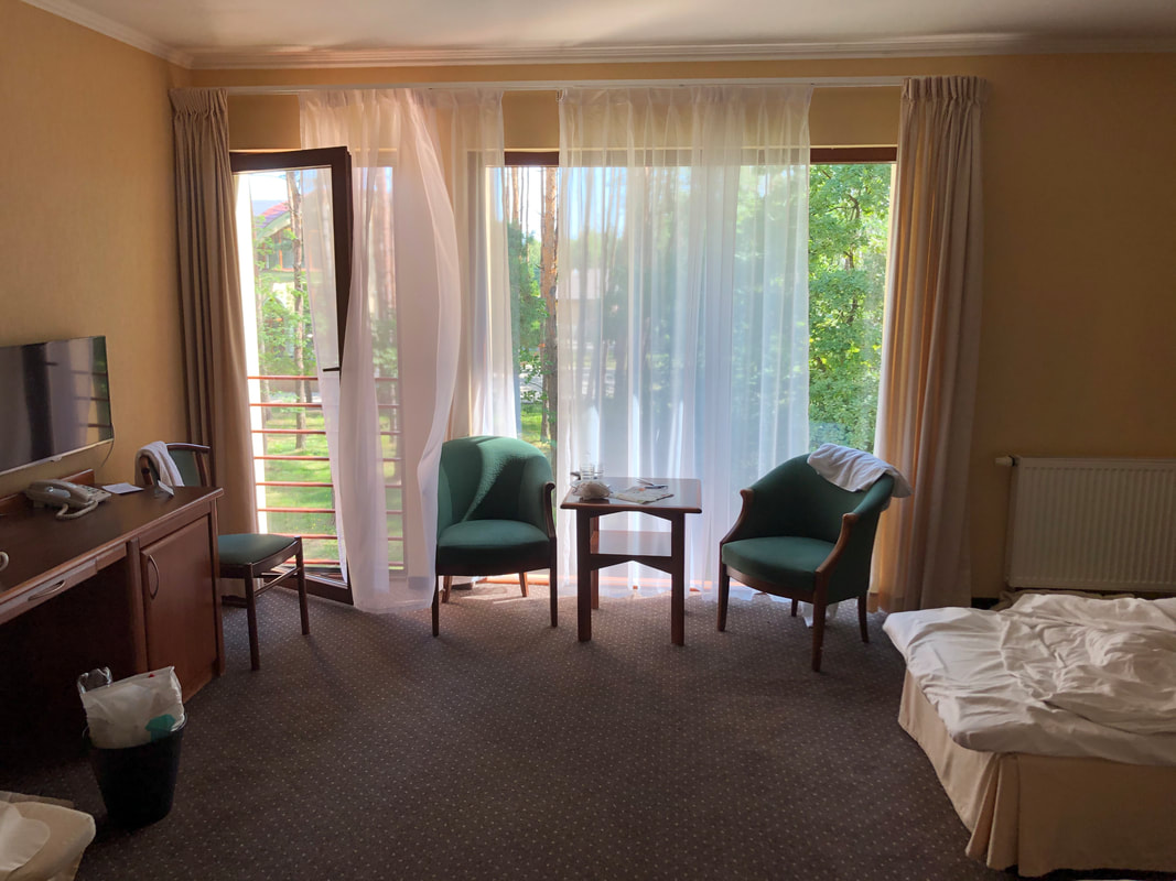
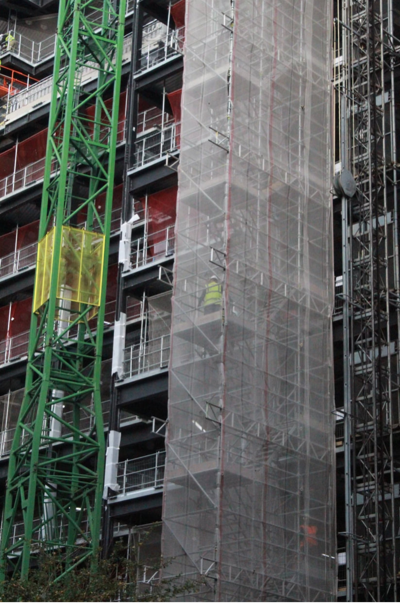
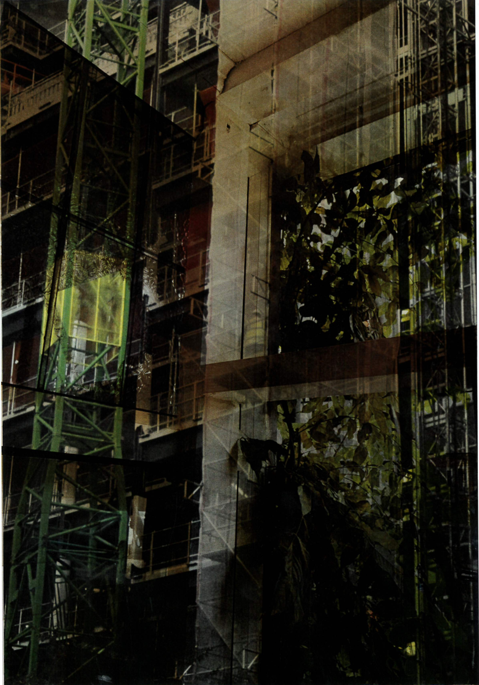
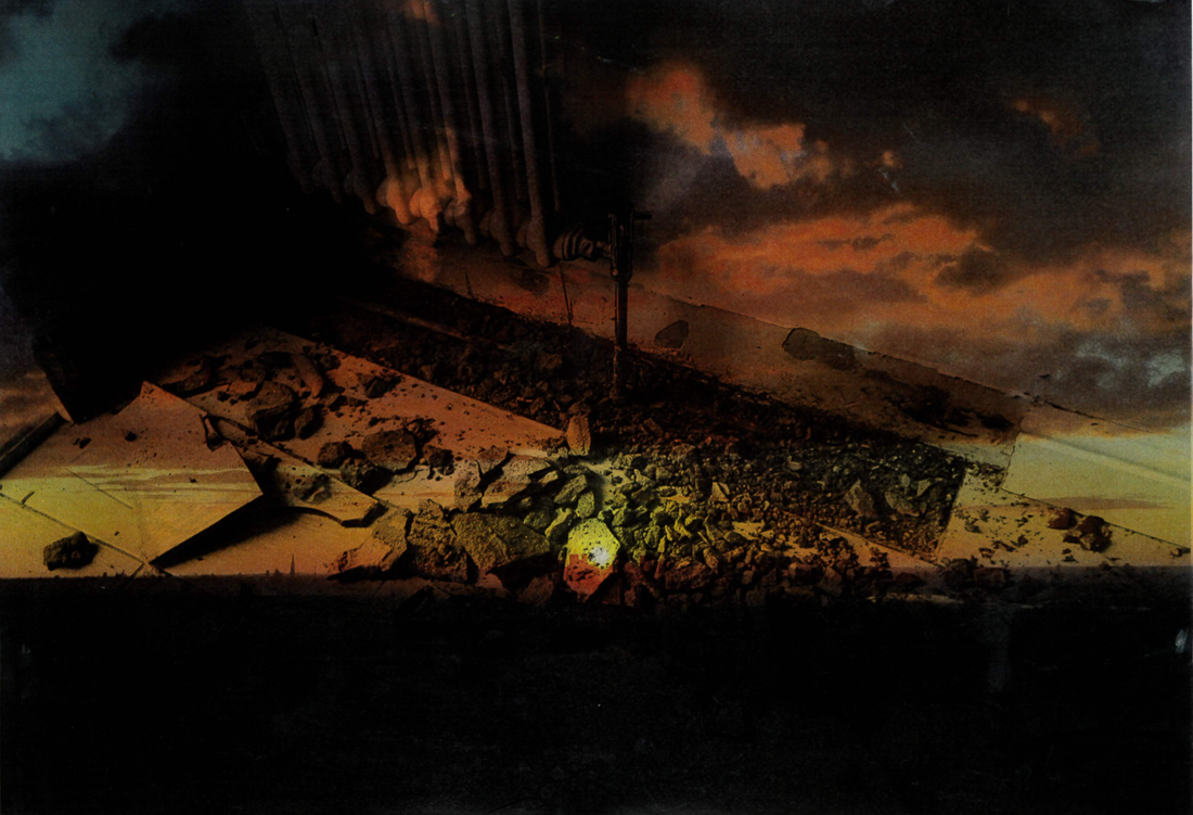
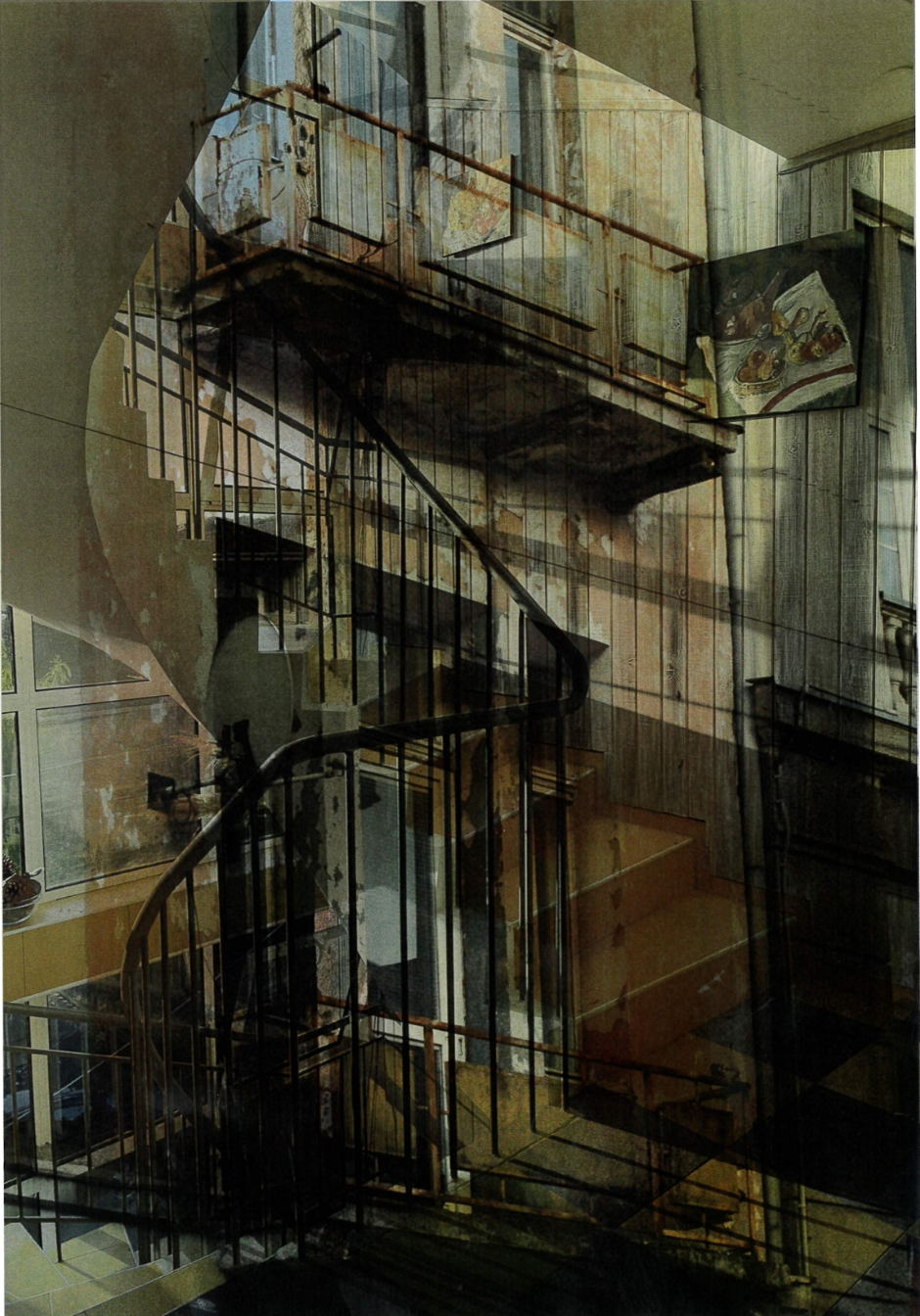
For this experiment, I decided to bring together two separate images and print them on top go each other. This was to experiment what I wanted to be added into my photo book and how I may want the images in my book to all look like. I put these together because I was thinking of which two images would compliment one another well however if I were to use this method in my book, I would use a dice to randomly determine which photos should be togheter using thresh hold concept number 6.
Bringing everything together
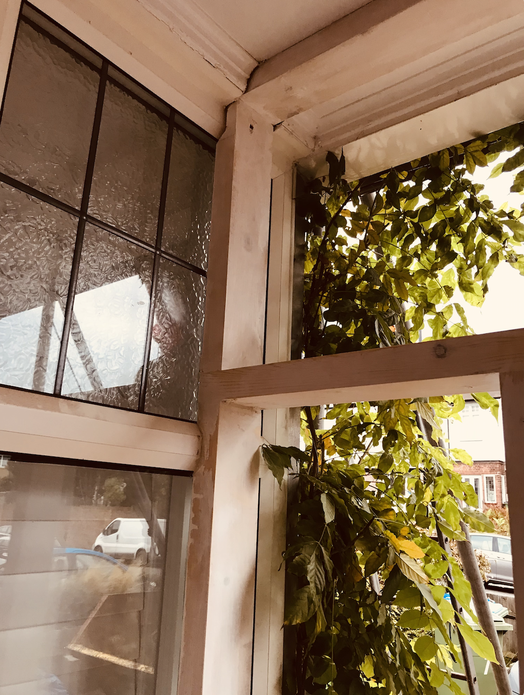
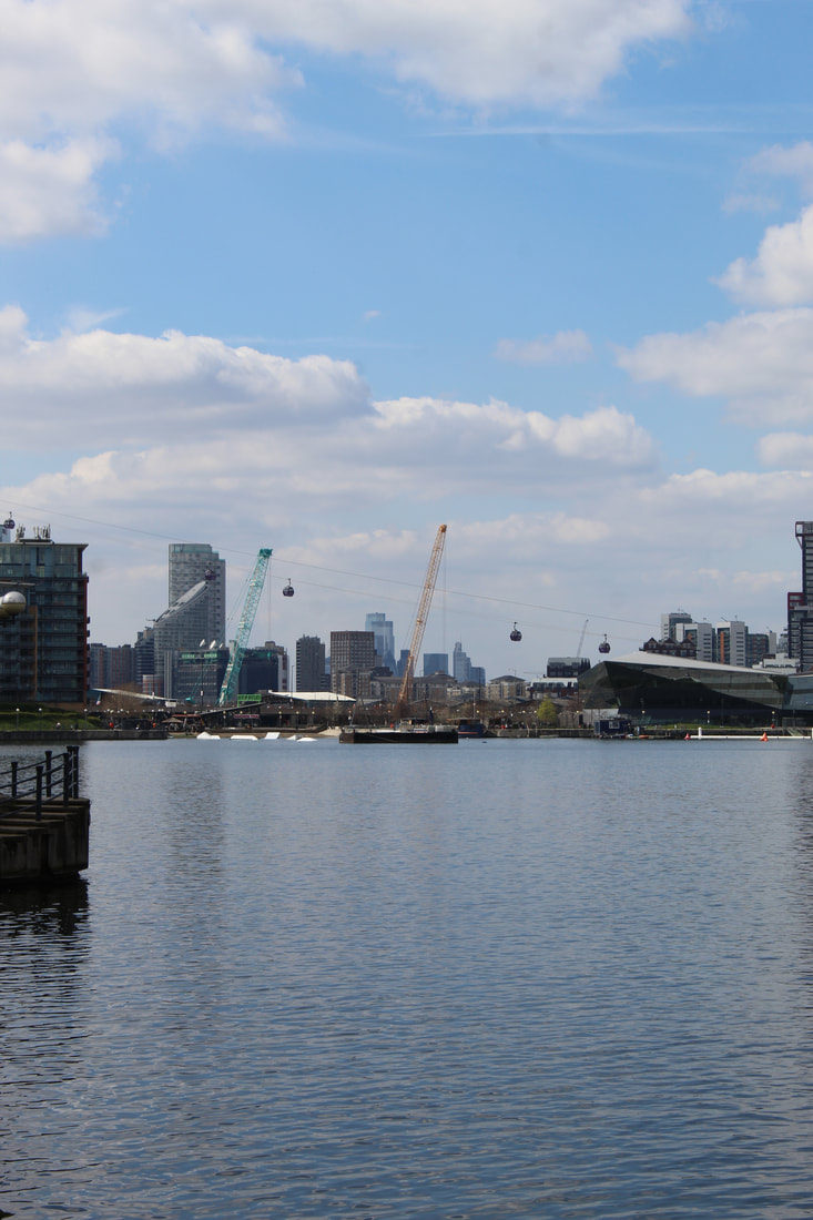
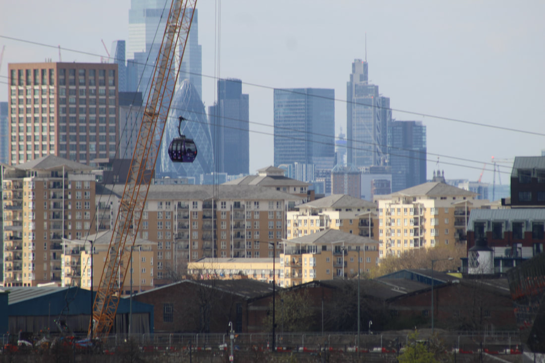
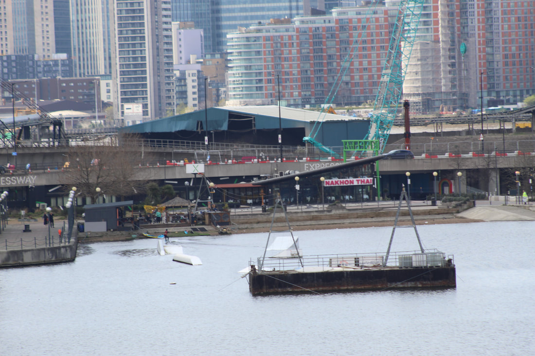
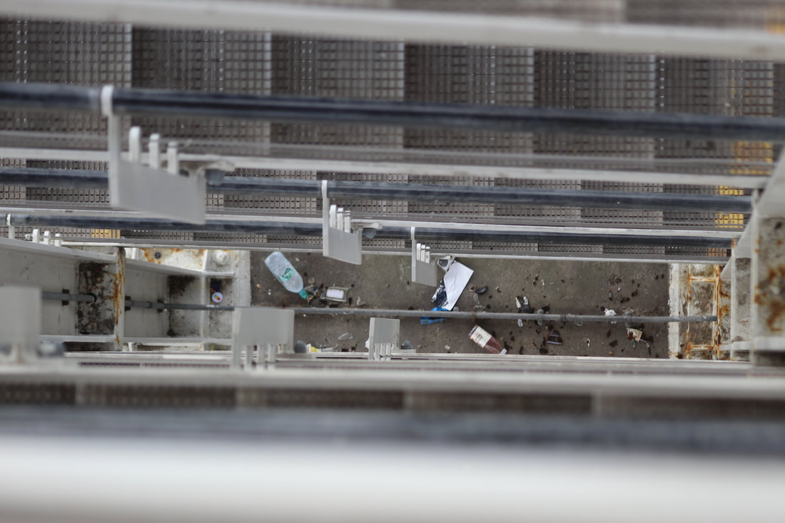
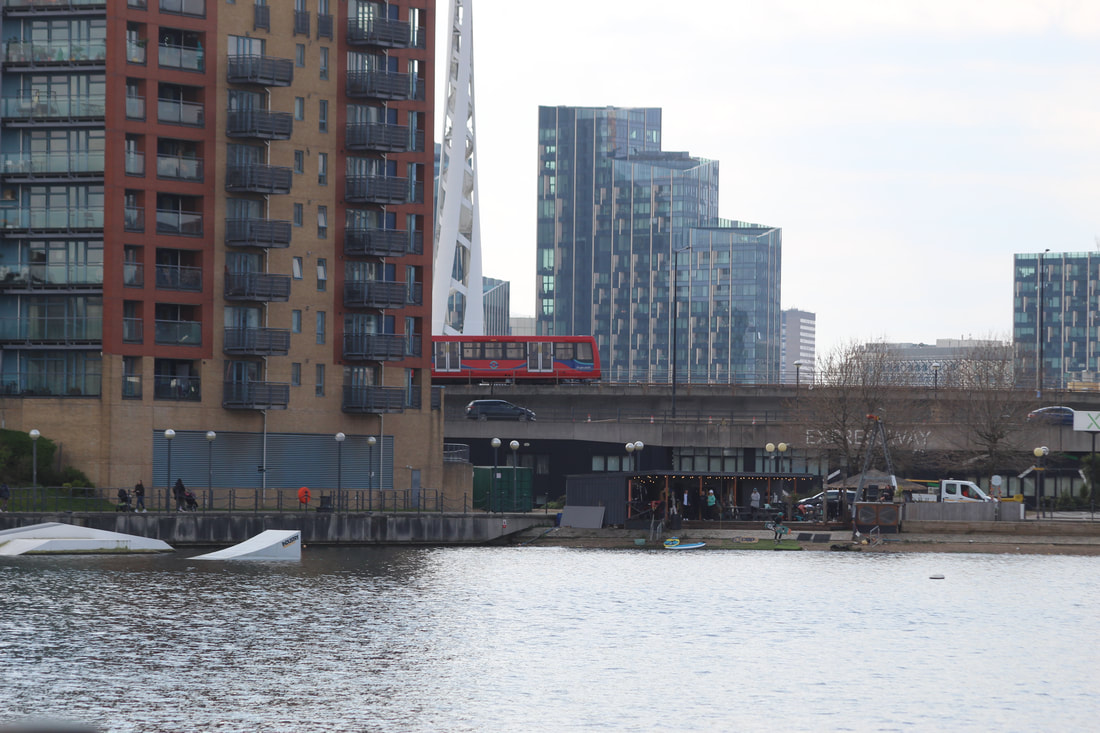
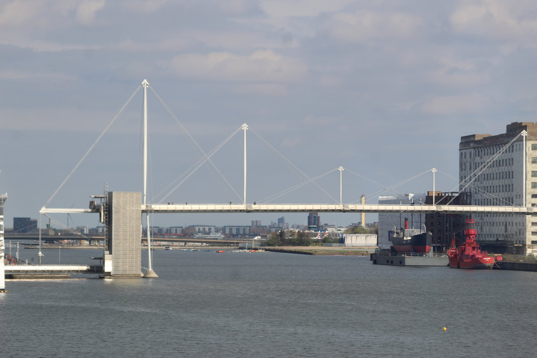
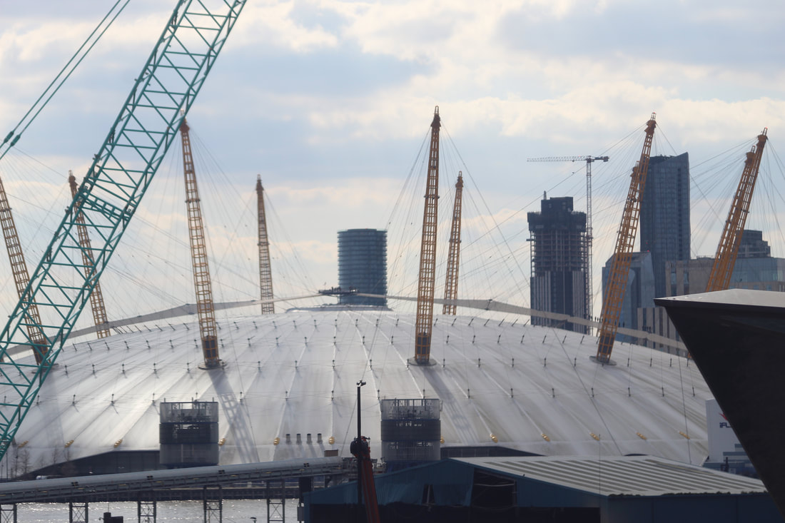
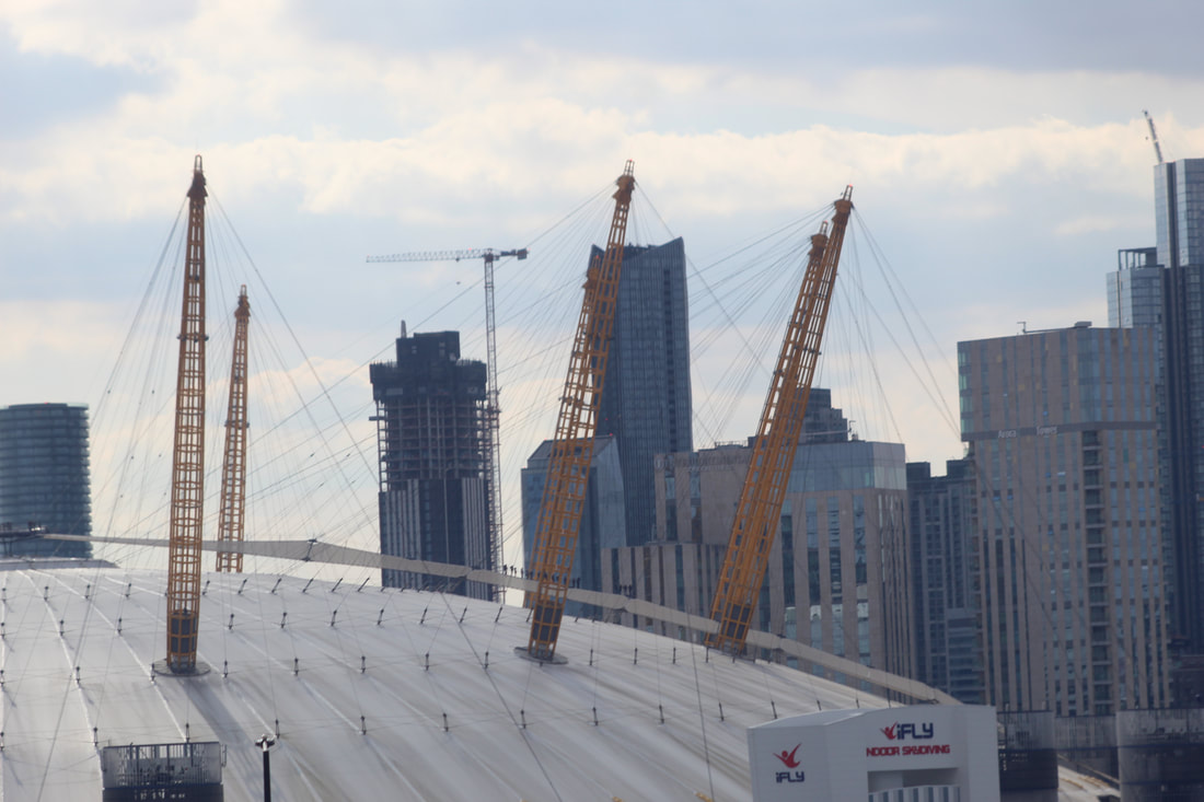
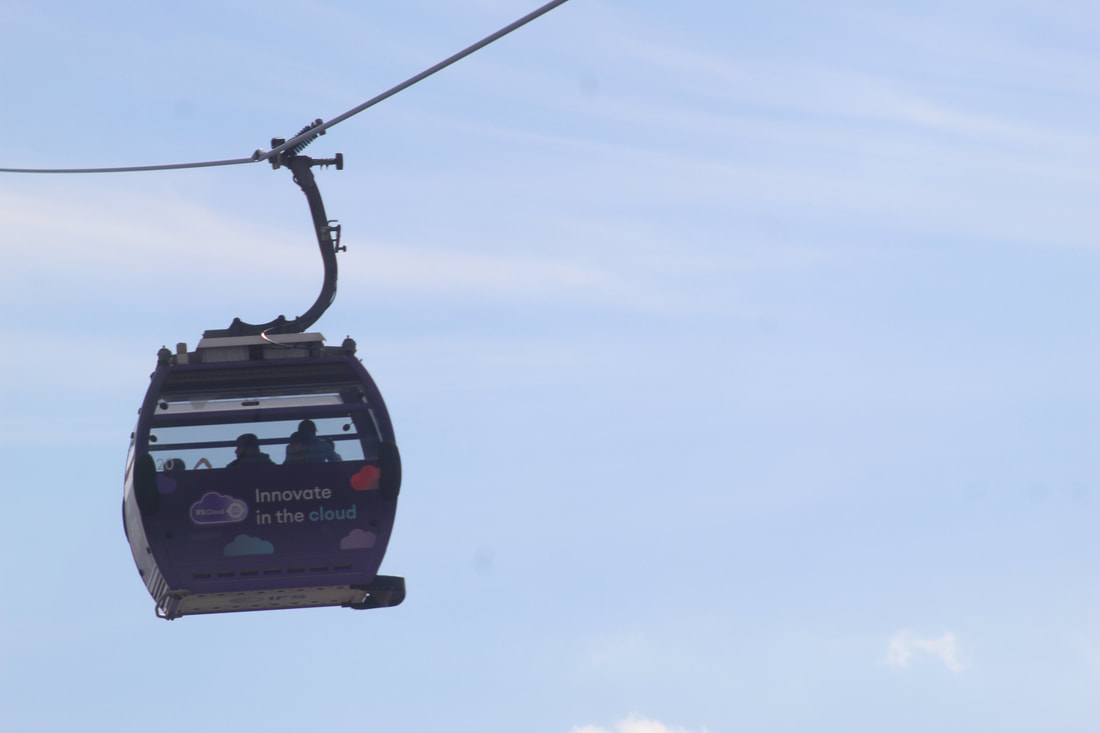
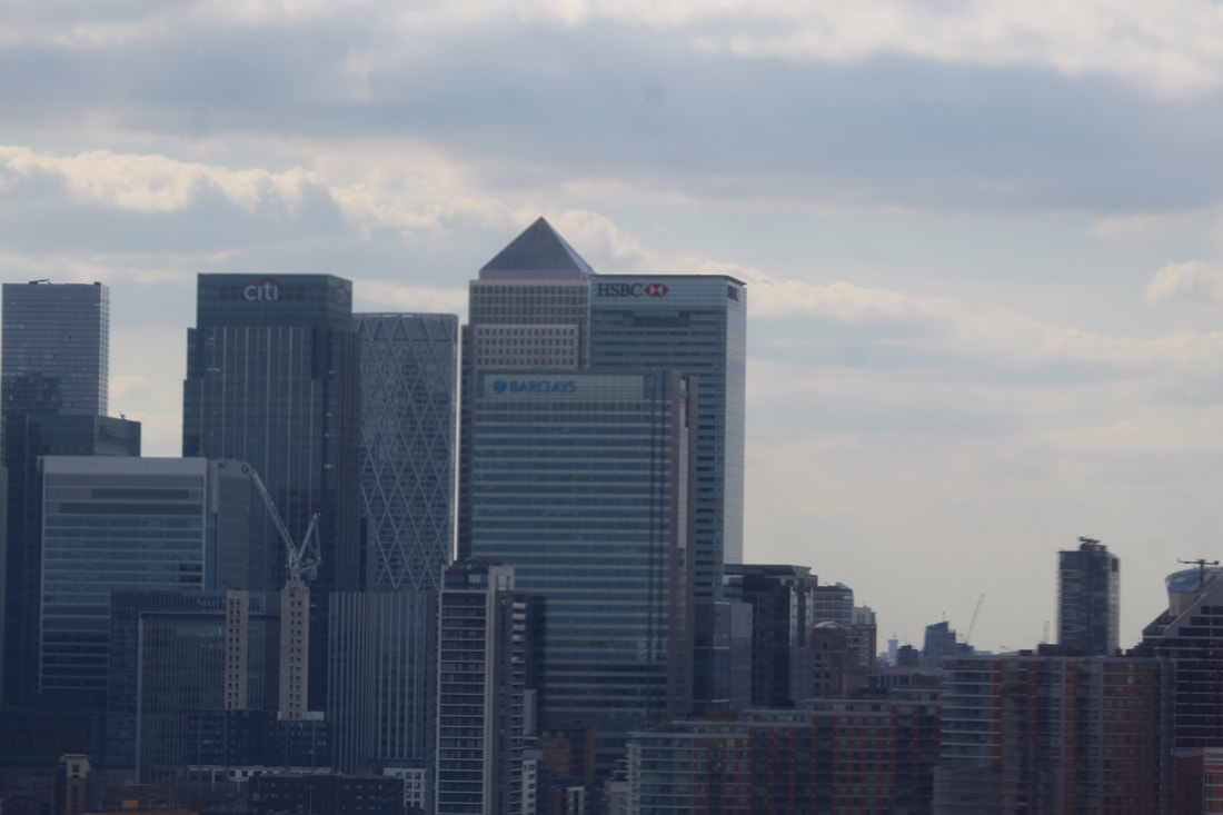
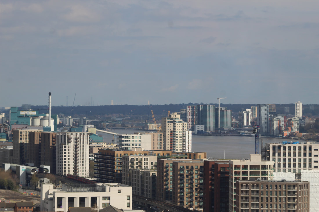
From my continues research and photo response, I wanted to make something that involves that different point of view but something that involves the outside more. For this, I went into Central and I took a couple photos from different perspectives.
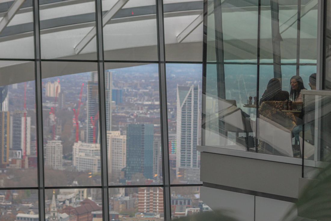
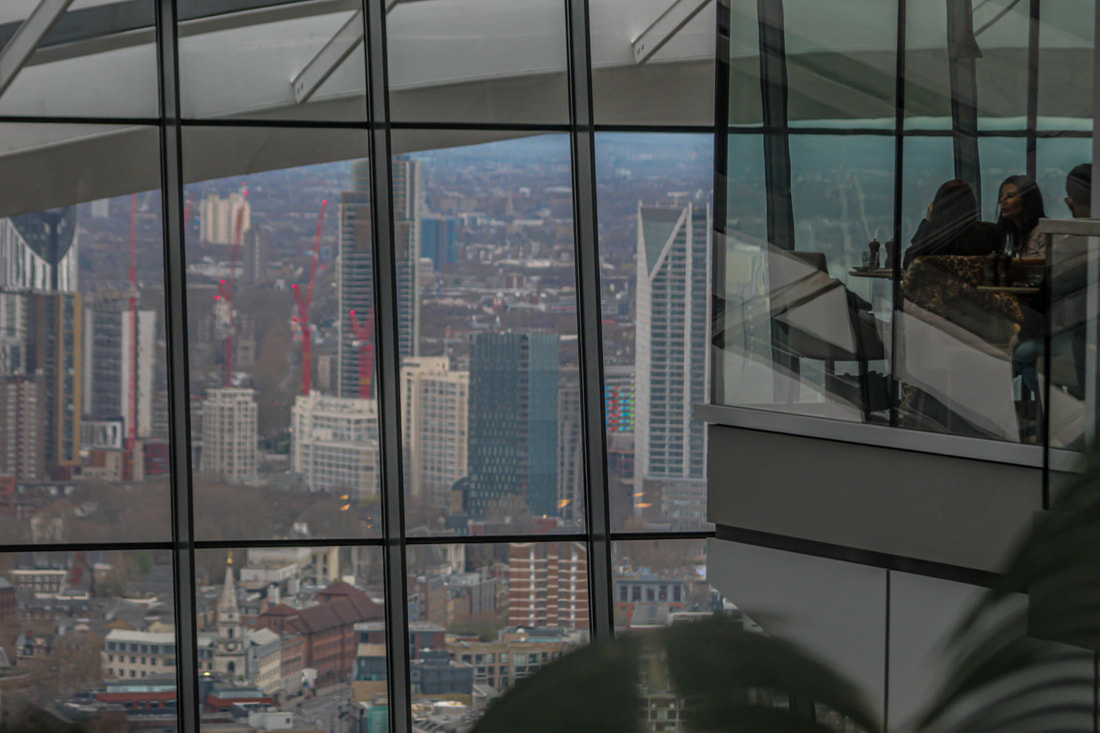
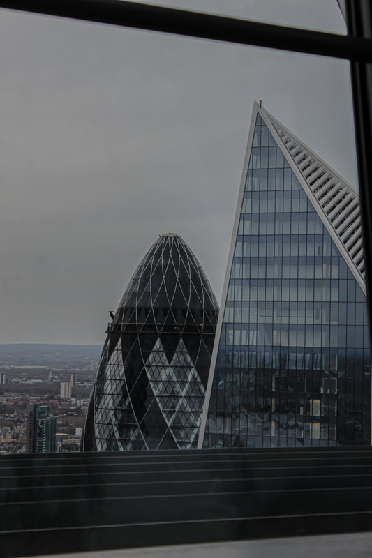
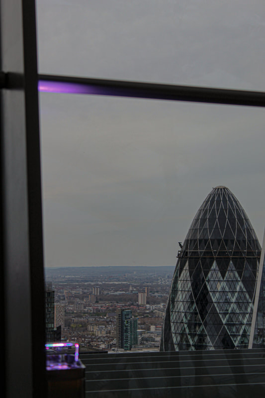
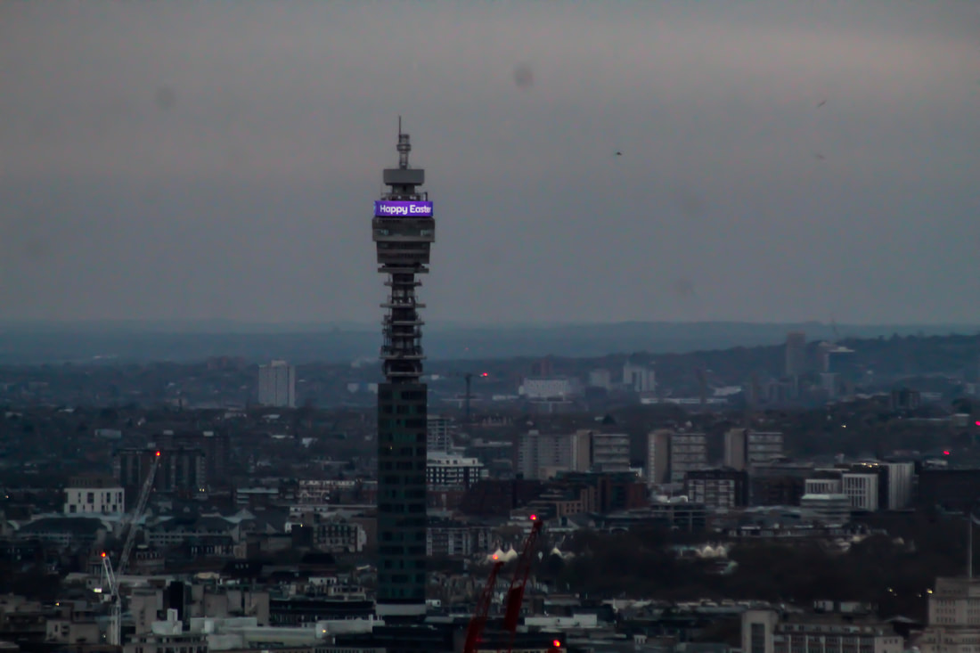
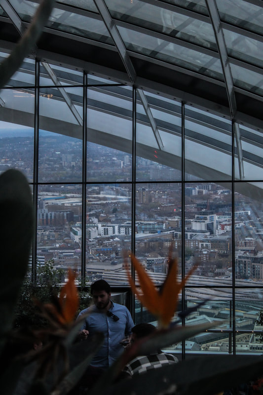
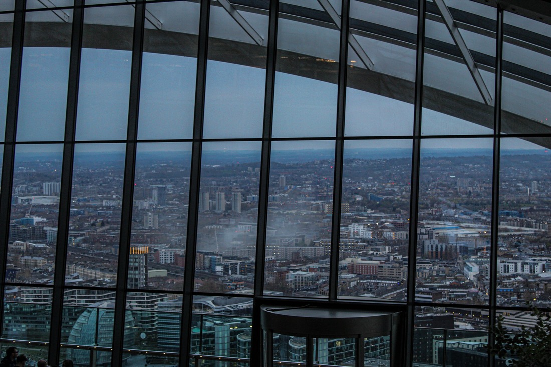
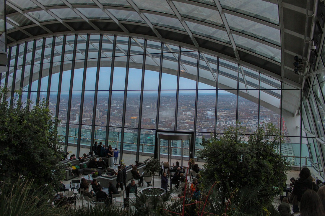
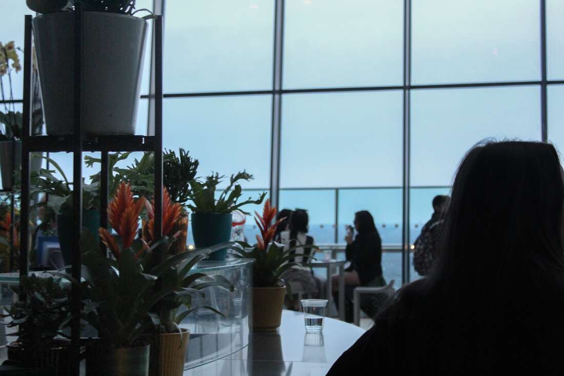
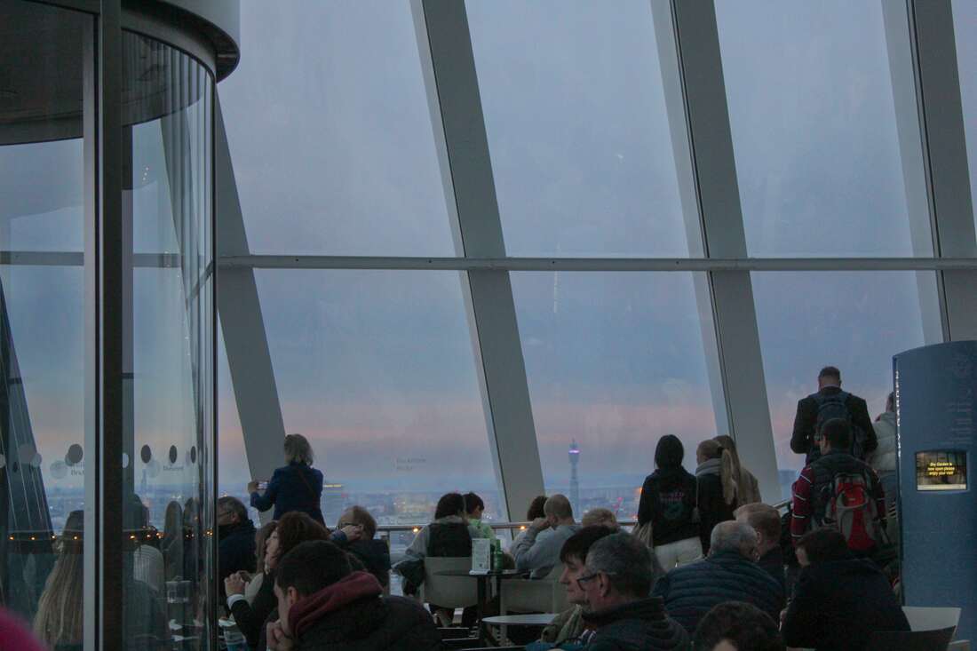
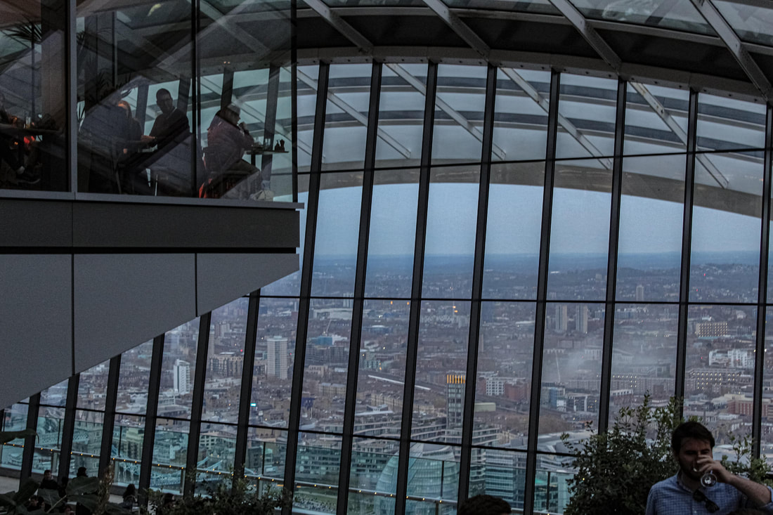
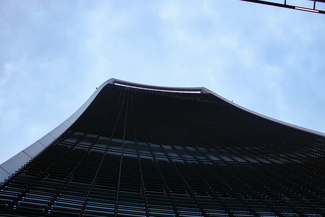
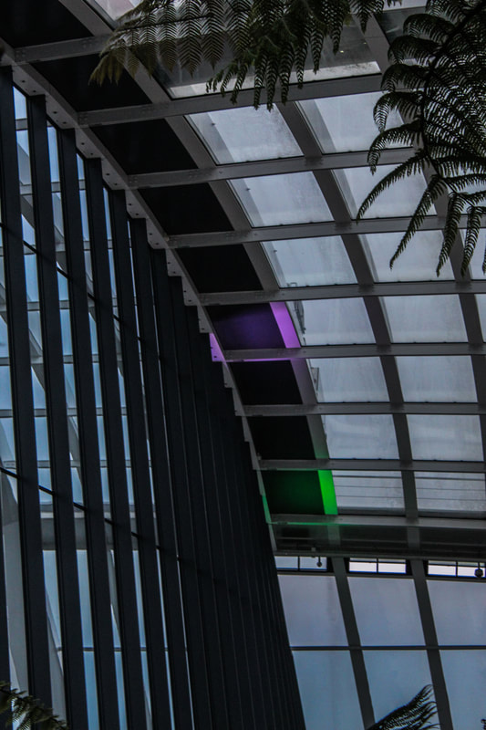
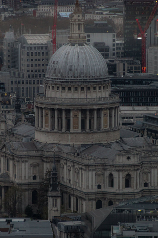
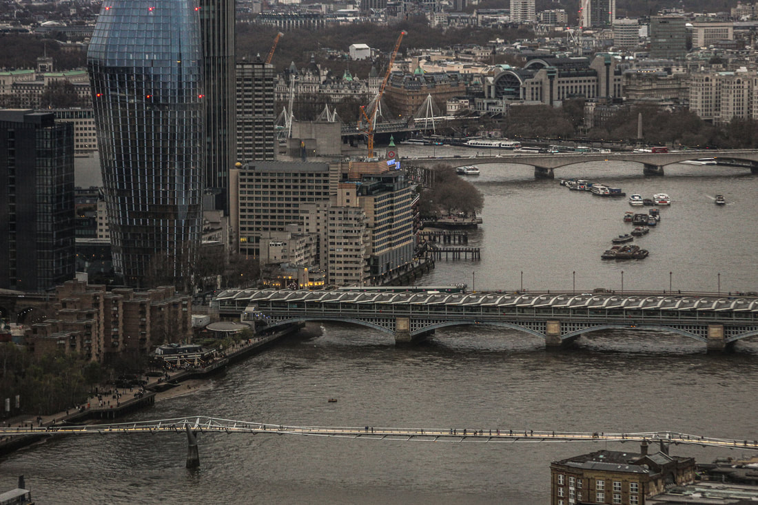
I really enjoyed this photoshoot, I liked the different approach I chose of taking the photos in public whilst still incorporating the theme of inside outside. The photos is took here are all based in central London, sky garden, where you can see the outside, showing London from up above, whilst still staying inside the walkie talkie building. Overall I really like these photos and their input to the inside outside theme.
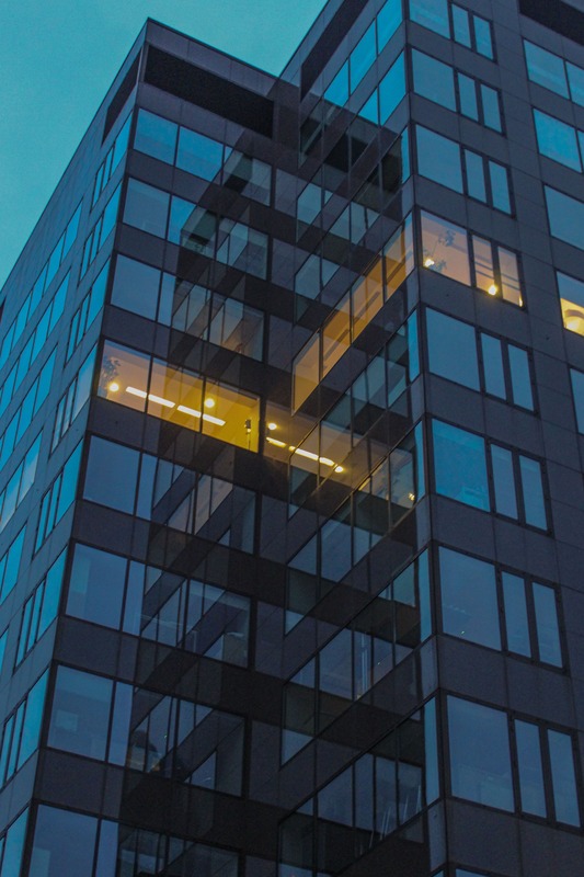
OUTSIDE PICTURES
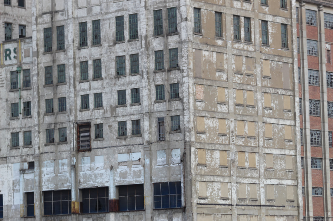
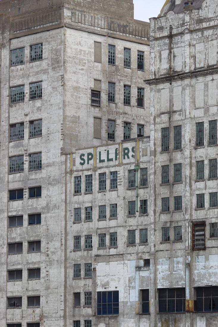
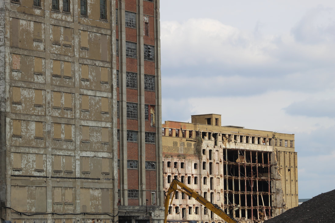

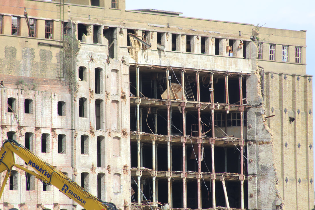
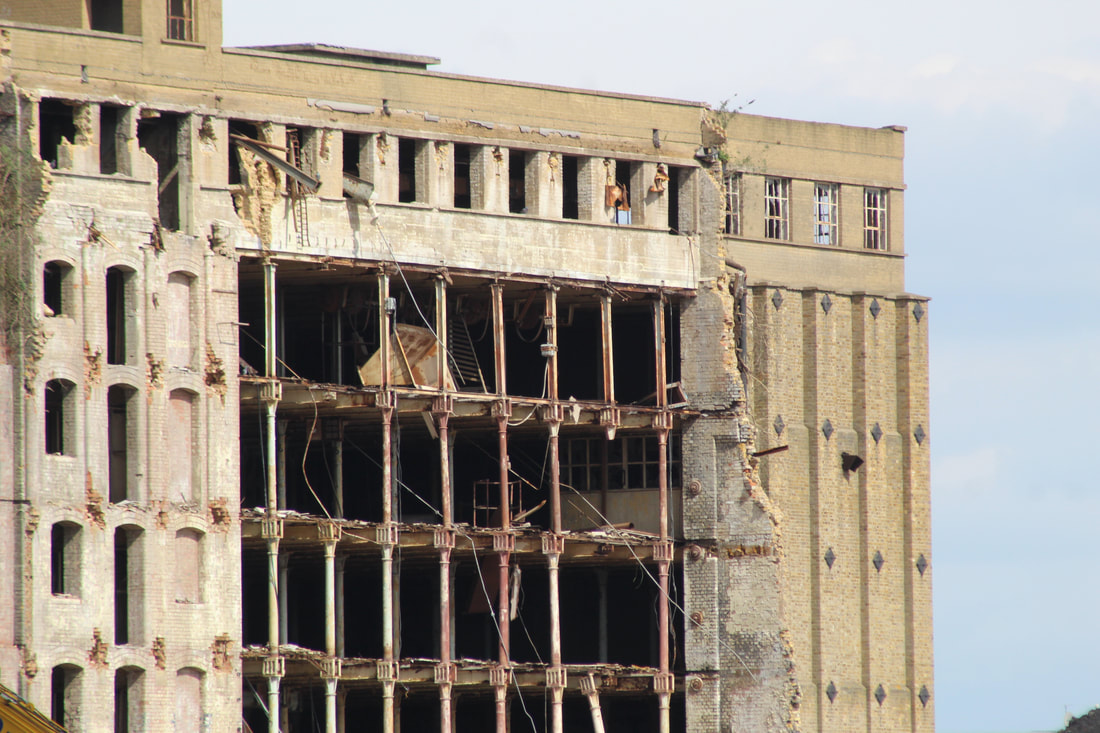
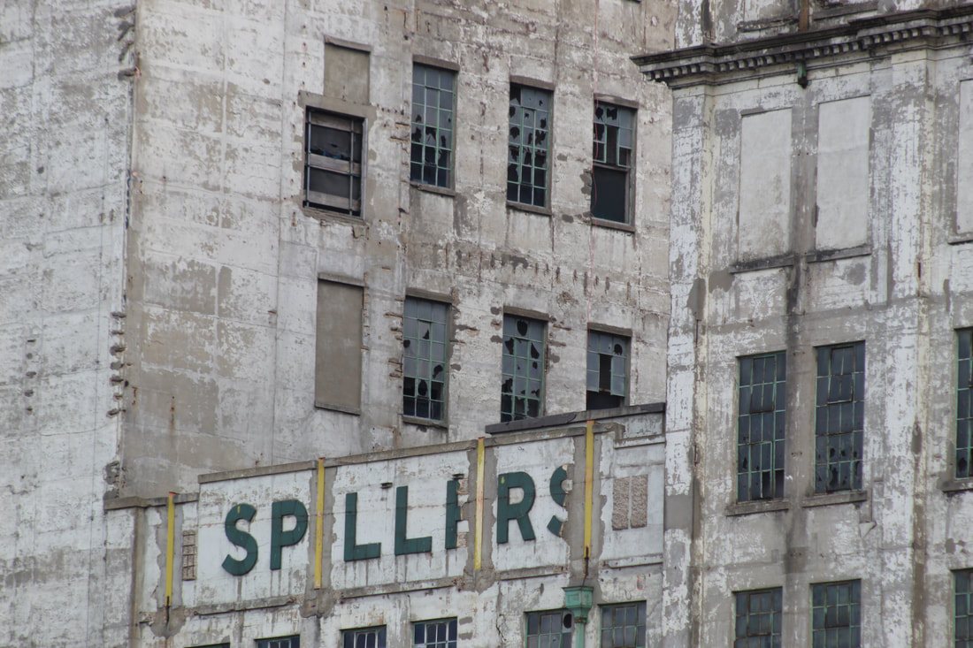


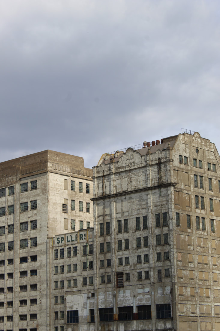
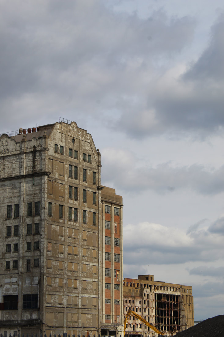
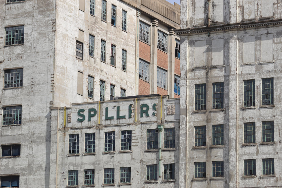
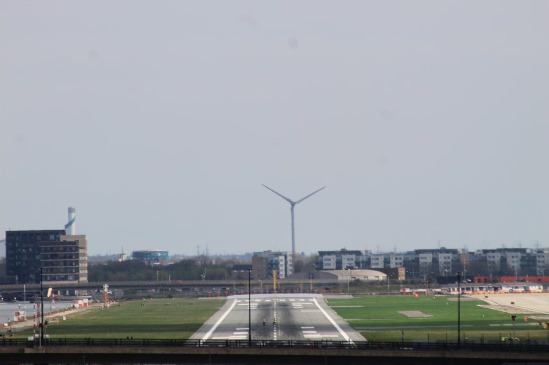
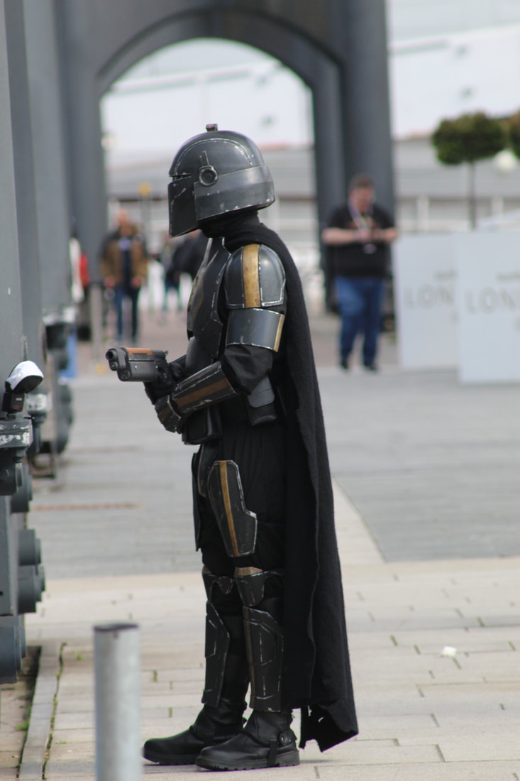
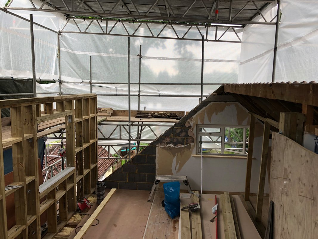
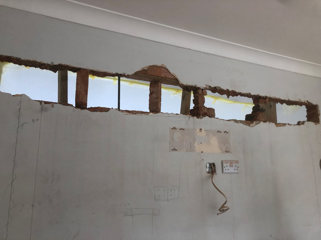
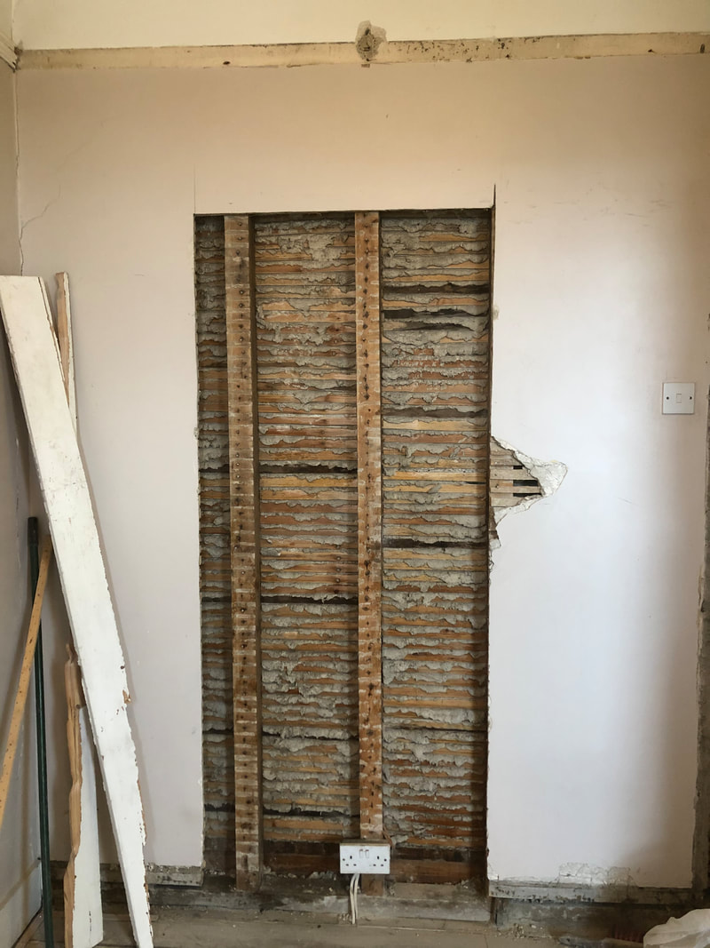
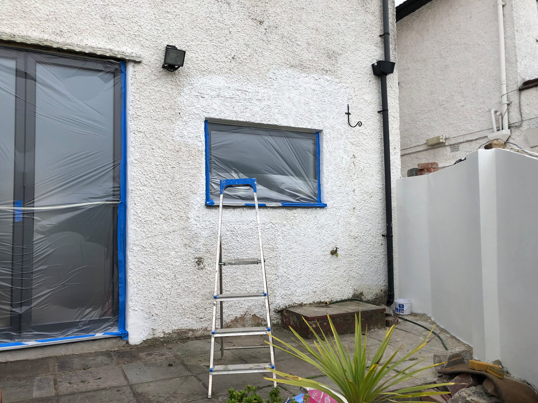
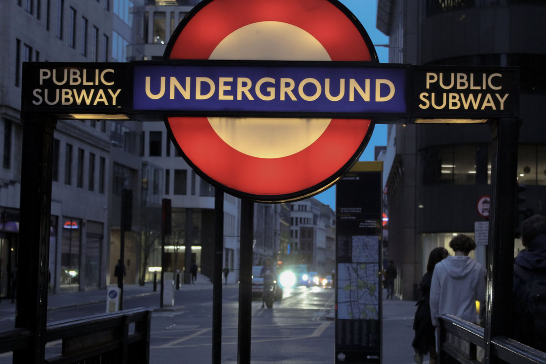
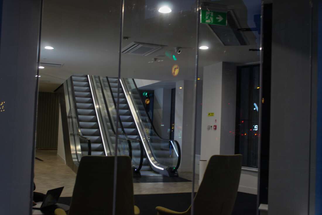
For this photoshoot I decided to continue with the theme of going out and taking photos to further expand on the inside outside theme. in the series, I captured both the outside and inside of what was once a mill and now is being regenerated into apartment buildings. the other photos where taken on my trip to and from the mills and took them still trying to keep a significance to the theme inside outside but sometimes forgetting to and just taking photos of random things like the person dressed up.
Binding Methods
When creating my book I believe that as of right now the best way to create it, is to bind it using one of the methods below. the ending result may vary on how I want the final product to present itself and how I want it to look visually.
Singer sewn binding - this stitch is a traditional method go book binding where a single thread is sewn / stitched through folded pages at the spin of the book. this method does not require any adhesive or staples and you can choose whether the stitching is visible on the outside of the book or water it is tucked in neatly on the inside of it.
Japanese binding - this is also a traditional method of book binding and is one of the more common ones, here the single leaves are laced together with a needle and thread, the exposed icing is treated as a feature to the style of the book.
Wire, comb or spiral binding - This method is one which is commonly use to manufactured books, however I like the texture and overall look it gives the final product, therefore it is in my options to buy a book which already has these on and create the inside on my book on my own.
How textures influence emotions
For my final project I want to create an interactive photo book, one that anyone can run their hand over and touch. In the photo book, not only did I want my photos to be displayed, but I also wanted the surrounding of the photo to be something unusual, and something that not necessarily matches the photo on screen.
From a young age we don't have emotions as much as needs. we don't feel lonely or desperate, we need love or just need food. Even in the womb babies feel the vibrations of their mothers hearts, this soothes them In a way, this is then something that they start to associate with being warm and being loved. Touch is the first sense we are aware off.
Embodied Cognition says your body and mind work together as a supercomputer, it proccess everything then forms our reactions. this is the reason why when we feel tiered the texture of our bed is so inviting to us. similarly, when we feel hot, the though / feeling of sinking into cool water makes us what to do so.
A groups of researchers set out to identify the emotions evoked by 21 different textures. including slime, velvet, silk, steel wool, leather. This researched showed that generally soft and smooth textures evoked pleasant emotional reactions while, rough or hard textures evoked negative responses. Other studies also show that textures can influence our moods and perceptions.
Small experiment
I knew that for my project I wanted to make something that was interactive, my first idea was to create floor boards and wooden walls to show some of the common materials that are used on the inside and outside of homes.
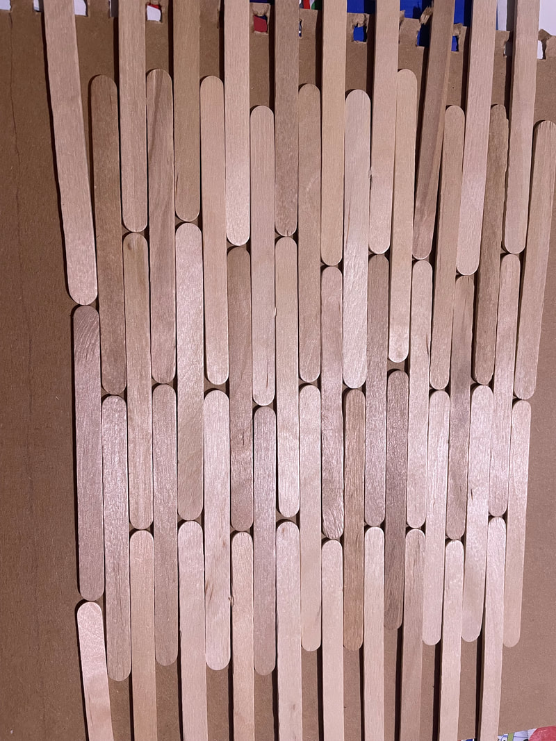
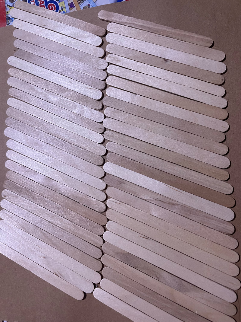
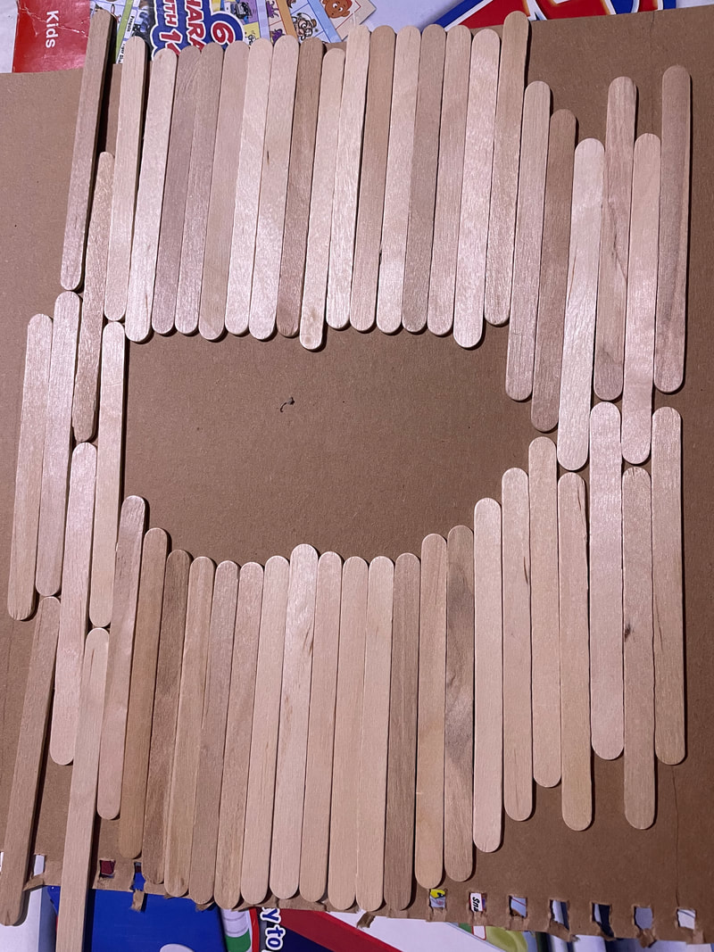
For this experiment, I was trying to figure out the best way in which to aline the wood so that it would look most like floorboards and would give the most texture and would look more like actual floorboards.
Exam
- Create a photo book which include not only my photos but different textures and patterns / designs using different and unique materials.
- in the photo book, include different words that are overlayed on one another and have the different emotions, thoughts or anything that a person could feel when flicking through the photo book.
